


The problem: The Unreal Engine 4 editor of 2017 mixed visual styles, odd font sizes and two kinds of icons, and it boxed nearly everything in borders.
The fix: I drew a concept redesign on my own: flat dark panels, one icon language, fewer borders, and a bridge version for people who wanted the old look. I posted it on the Epic forum and read every reply.
In short: The thread passed 79,000 views. Then the UE5 editor arrived with the same direction. This article shows what I proposed, what people said, and what the UE5 interface looks like now.
- Author
- Ivan
- Work
- UI and UX redesign concept for the Unreal Engine 4 editor
- Published
- February 2017, on the Epic Games forum
Contents
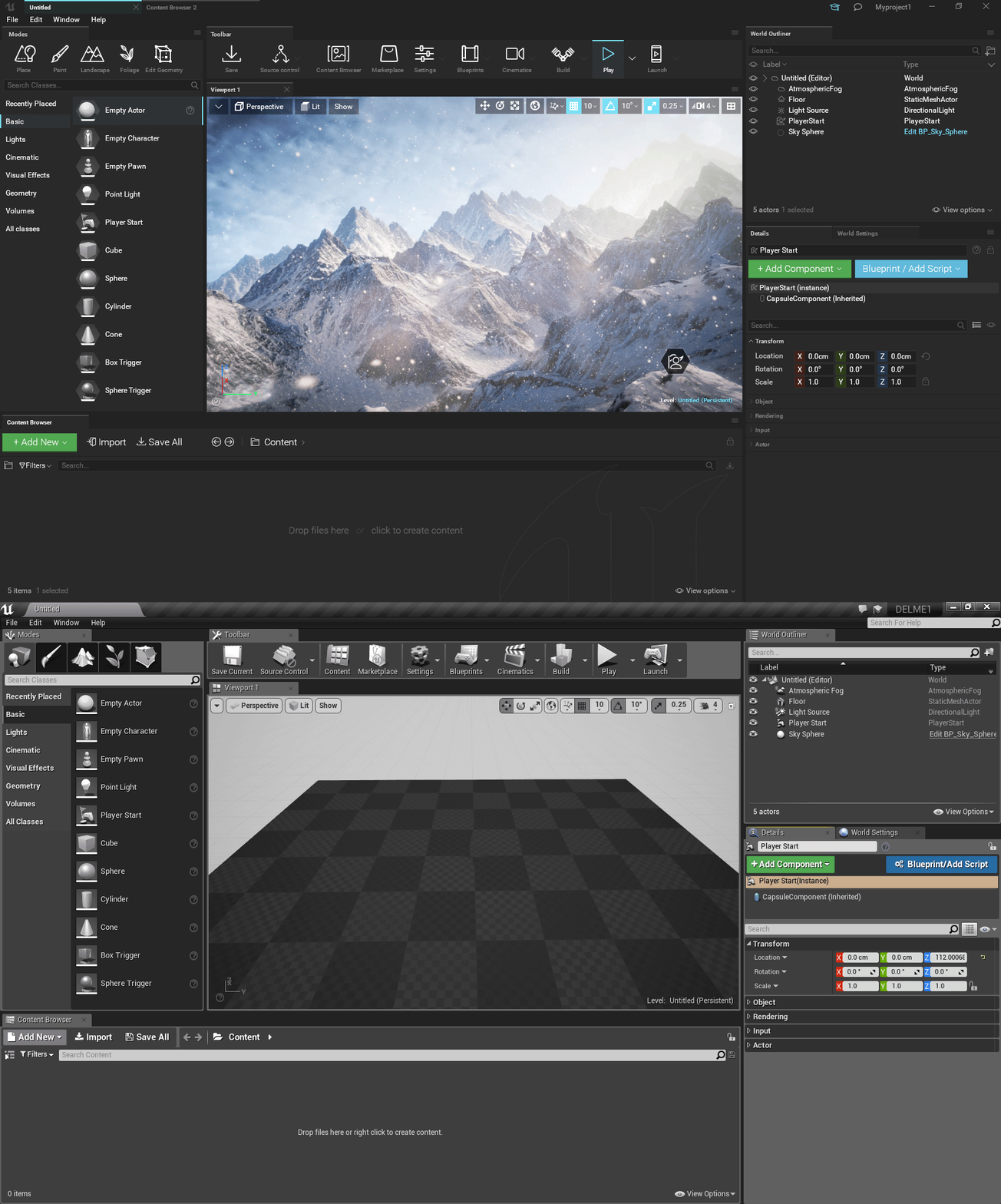
I could not stand the old Unreal Engine 4 editor. It was powerful and it was ugly to work in, so in February 2017 I drew a new one and posted it on the Epic forum under the title “Unreal Engine 4 Deserves Clean UI”. This UI redesign case study shows what I changed, how the community reacted, and how close the UE5 editor came to the same design.
UI Redesign Case Study: What Was Wrong With the UE4 Editor
The UE4 editor was powerful and visually uneven. I wrote down what I saw before I drew anything:
- Several visual styles at once, as if each panel had its own designer.
- Font sizes that jumped from panel to panel for no reason.
- Two icon languages, some drawn from the front and some in perspective.
- Heavy colors on the XYZ controls that pulled the eye away from the values.
- Borders around nearly everything, so the screen read as a grid of boxes.
- Small question marks and repeated icons next to text that already said the same thing.
The editor needs a more compact UI. So much space wasted.
None of this blocked anyone from working. It made the editor tiring to look at all day, and that is a real cost for a tool people live in.
Game UI Redesign: What I Proposed
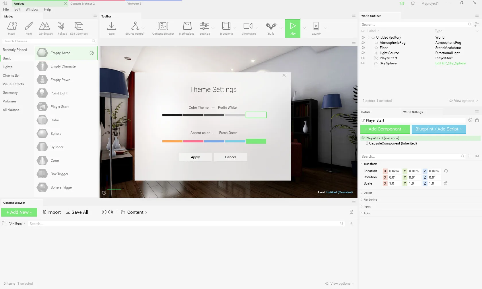
I treated the redesign as two separate jobs. The first was how the editor looks: colors and icons. That is a matter of taste, and some people will always dislike a new look. The second was how it works: the small changes that save time every day. I kept the two apart so that someone who did not like the look could still judge the useful changes on their own.
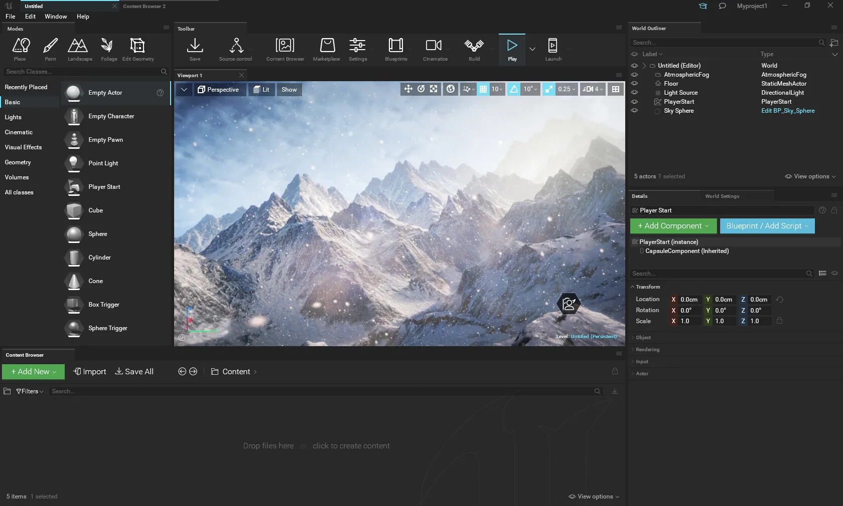
The new look made the panels flat and replaced borders with empty space. It kept one font scale, redrew the icons as one thin-line set and toned down the colored axes. The changes to how it works were small and practical: collapse a panel with a double click on its border, smaller group titles, and moving, rotating and scaling with the mouse.
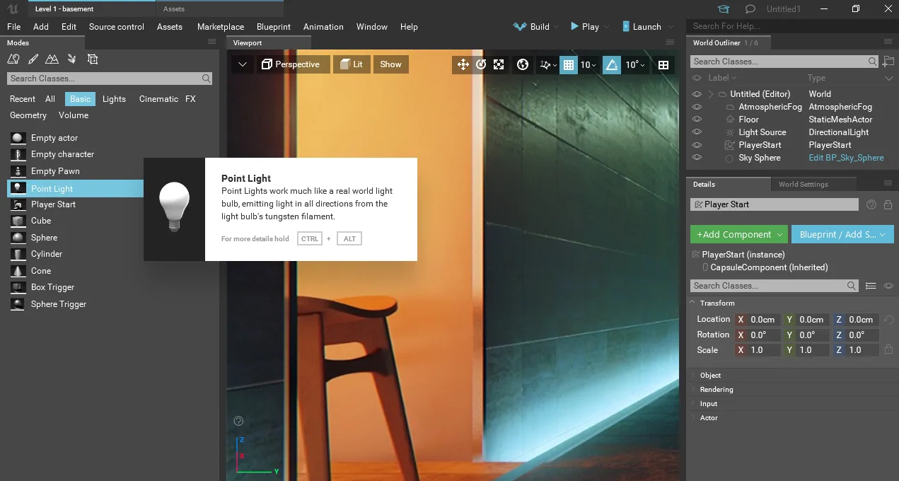
Two more new ideas: a laptop mode with smaller icons for small screens, and richer tooltip cards that show a picture and a short description of an item.
UI UX Redesign Case Study: What the Community Said
I asked for criticism directly, and the thread gave me a lot. By my own count at the time, about 85 to 90 percent of the replies liked the new look with small suggestions, and 10 to 15 percent did not, usually because of flat icons or contrast. Some replies came from people who loved the native UI and thought it needed no changes. Their argument was fair: a good-looking editor that costs you speed is worse.
Not everything held up. Some people found the contrast too low and the line icons too thin, and the bright version never left the experimental stage.
I just wanted to say that your design looks superb! I love it.
The feedback I collected:
- Less black, maybe a gray version, or a white one.
- Huge icons that waste space, and wasted space in general.
- Toolbar icons as text to save a long row.
- Pin tabs so the default layout does not move by accident.
- A light variant for people who do not like dark themes.
- Care about hotkeys, flows and productivity above everything else.
Yours might be more elegant, but it’s worse for productivity.
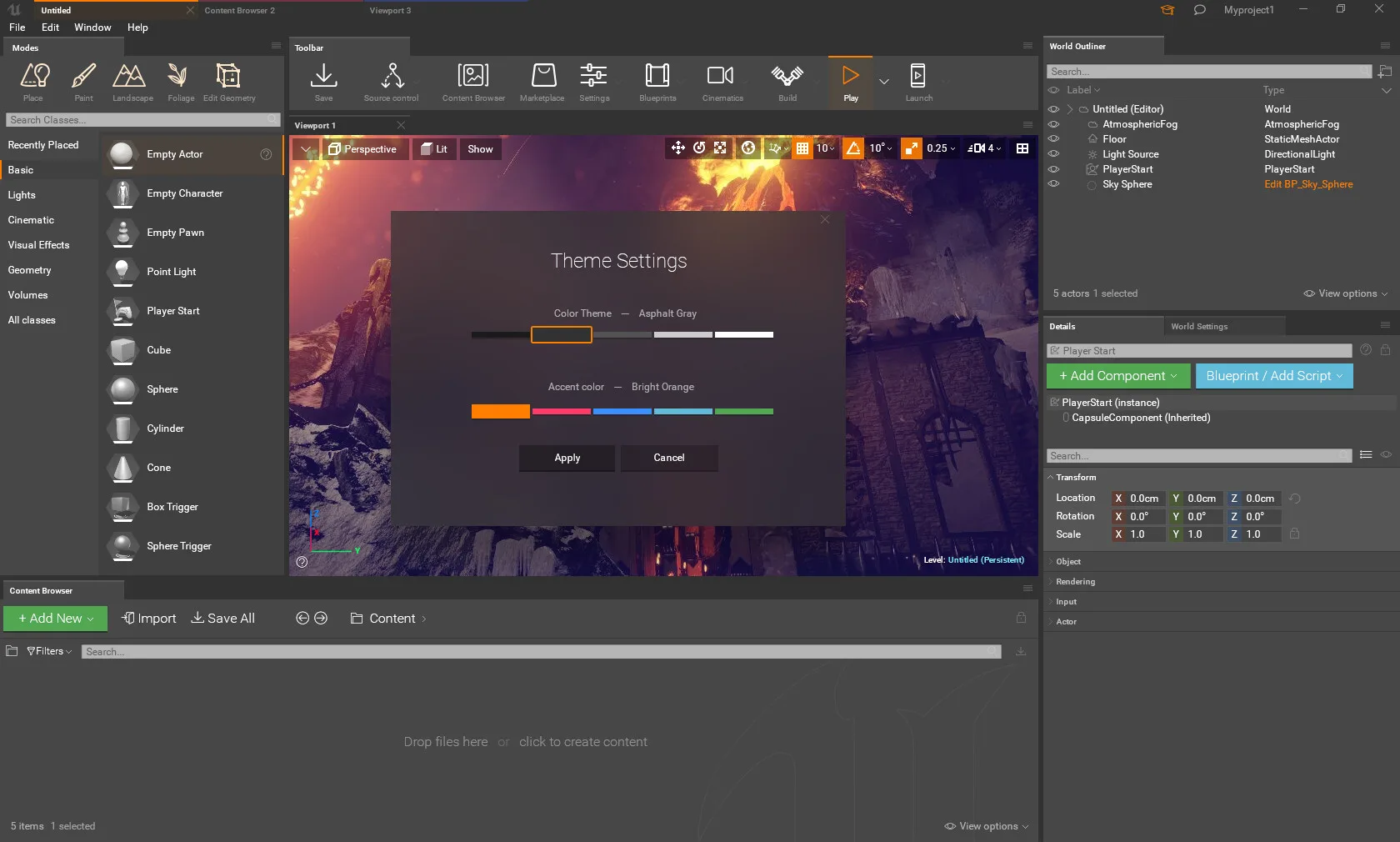
Two things came out of this. First, a “bridge” version that kept the vanilla icons and the familiar layout, for people who wanted less noise but not a new tool. Second, a theme dialog with a color theme and an accent color. The same screen could be dark with an orange accent or light with a green one.
Unreal Engine 5 Interface: What Showed Up Later
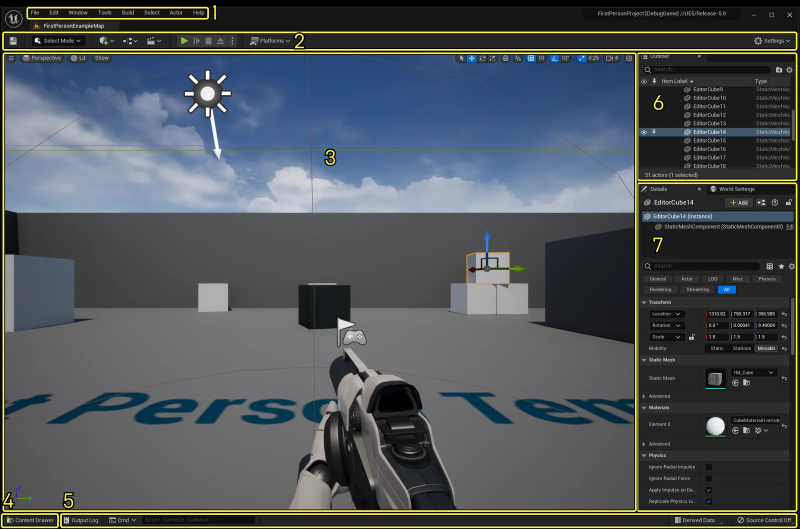
Here is the default UE5 editor, from Epic’s own documentation.
I like it 🙂
What I proposed is what the new editor looks like:
- Flat, dark panels. Fewer boxes and borders, panels separated by space and tone.
- One slim row of small icons. The main toolbar is a single row, with a clear Play control and a Settings menu on the far right.
- A drawer instead of a permanent panel. The Content Drawer button sits at the bottom left, and the drawer minimizes when you click away. You can dock it in the layout if you want it to stay. My concept had asked for the same thing: less permanent clutter, more room for the viewport.
- The left panel moved. The permanent Place panel from UE4 is gone from the default screen. Placing common assets starts from a Create menu in the toolbar.
- One look across editors. Release notes keep updating other screens to match “the modern Unreal Editor dark theme”, so the editor stays consistent as it grows.
Four years later, after the UE5 overview, I came back to the thread:
I think they’ve listened to us, just saw the UE5 overview and what I see, finally content browser, left panel are hidden and overall the UI looks flat and modern)) even some ideas are implemented pretty close to the concept that was made almost 5 years ago!
Tips for Redesigning a Complex Tool
- Write down what is wrong in plain words before you draw anything.
- Remove noise before you add features: borders, duplicate icons, labels that repeat what the control says.
- Use one icon language and one type scale.
- Separate how it looks from how it works, so people can judge each on its own.
- Ship a bridge version close to the old look for people who fear change.
- Protect speed: keep hotkeys, flows and density that experts rely on.
- Offer a light and a dark theme and a choice of accent color.
- Publish early, read the criticism, and change the concept in public.
Planning a UI Redesign?
If your product has an interface that feels heavier than it should, send it to us for a UI and UX design look. We will look at it and tell you what we would remove first. Free. You can also read how we handled a sales page redesign for a health product or see what a design project like this costs.
Frequently Asked Questions
What is a UI redesign case study?
A write-up of one interface redesign: what was wrong, what changed, why, and what happened afterwards. A good one shows the reasoning and the pushback, not only the final screens.
How do you redesign a professional tool without upsetting its power users?
Offer a version close to the old look first. In this project the “bridge” variant kept the vanilla icons and layout and removed only noise, and a separate, bolder variant went further. Power users judge a redesign by what it does to their speed, so hotkeys and flows come before looks.
Did the UE5 editor end up looking like this redesign?
Yes, in the main points: flat dark panels, one row of small toolbar icons, a Content Drawer that tucks away, and no permanent left panel. The concept asked for each of these in 2017.
Should a redesign offer a light theme?
If your audience works in different lighting, yes. In the thread, a light variant was one of the most repeated requests, and the concept got a color theme and an accent color switch because of it.
How long does a redesign concept take?
This concept took more than 65 hours of work by one designer, by the count in the original post. A client project is faster because the brief, the audience and the access to users are already there.
Read next
Sales Page Design for a Health Product: What We Changed. A redesign that kept the buy button in view and the reviews honest.
HIPAA-Compliant Website Design: 7 Lessons From a Real Case. Plain service names, a one-field demo form and an isometric header, over five years with one client.