

 Ivan
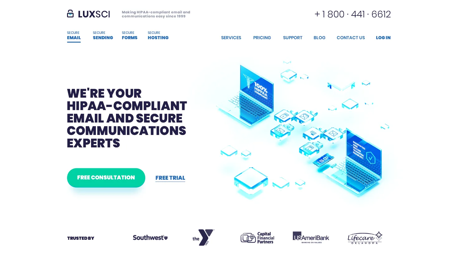
IvanThe problem: LuxSci sells HIPAA-compliant email and hosting, and its old homepage buried that under jargon, a hero video that looked spammy, and call-to-action buttons you had to hunt for.
The fix: plain service names, one main button, a single-field demo form, and a header illustration that shows an idea instead of listing features. We worked on the site on and off for five years. The last message came in July 2023, asking for vector files of a logo we had drawn in 2018.
Most guides to HIPAA-compliant websites stop at the legal layer: encryption, signed agreements, audit logs. Those matter, but a visitor never sees them. A visitor sees whether the page makes sense in the first few seconds. This is the design side of the LuxSci project, from our own messages with the client: what we changed, where they pushed back, what went over budget, and what we would do differently.
We audited the old site before drawing anything
The first thing we sent LuxSci was not a mockup. It was a written list of what was wrong with the existing homepage, and it was blunt. The hero video, with animated characters explaining the product, felt “like a spammy landing page designed to grab fast cash for a few days and vanish.” The calls to action were there but you had to play what we called a pixel hunt game to click one, because an unnecessary slider sat in the way. The page was crowded, and weak contrast and small type did not help.
Then we wrote the goals on one line: more visible calls to action, less friction, less clutter, better copy. We looked at about a dozen providers from LuxSci’s own competitor list, Hushmail for Healthcare, Paubox and Virtru among them, to see what the category already looked like. And we rewrote the homepage copy in a shared document before anyone opened Photoshop. Words and layout first, colors after. A text document is the cheapest place to disagree, and Erik Kangas, LuxSci’s CEO, could read it and comment on it from day one.
Naming the services took longer than coloring them
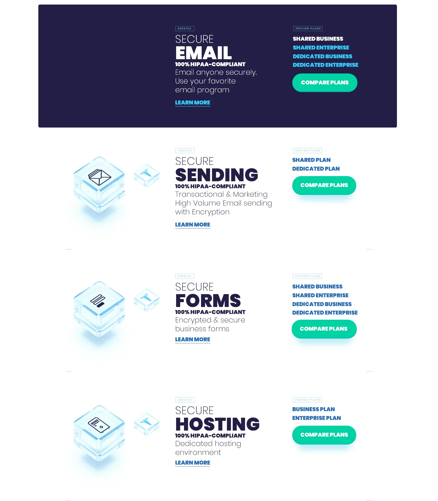
The old navigation called one service “Mailer”. Erik was not sold on it. Spotlight Mailer was already the name of a specific sub-product, so the generic word would confuse people who knew it. We changed it to “Sending”. He also asked us to put “Secure” in front of every service name, to keep repeating the one idea the company wants to own: Secure Email, Secure Forms and so on.
The descriptions needed the same care. Secure Email is a complete hosted email service, but its tagline in our first draft was all about sending, so it read like the next product on the list.
Hosting needed a correction in the other direction. We had written “encrypted and secure”. Erik pointed out that LuxSci cannot promise that, because whether a site is secure depends largely on how the customer builds it. What LuxSci provides is a dedicated environment where a compliant site can be set up with confidence, and that is what the page says. Hosting is also dedicated only, with no shared plans, so its card lists just the Business and Enterprise options.
The order of the services changed more than once. In 2018 Erik wanted email and sending first, then forms, then hosting, ranked by how much each matters to the company. In the 2019 refresh the list became Secure Email Marketing first, High Volume Secure Email second, and a third card, “Secure Email, Your Way”, for custom setups.
Six calls to action, and the free trial converted at 6%
Early on, Erik listed every call to action the site already had: free trial, call sales, chat with sales, a contact form, a free consultation page, and a personal “Ask Erik” page. Some numbers came with the list. The free trial converted at about 6%, which he called not the best call to action, because “we really want to get a sales person engaged.” Calling sales had a very high conversion rate. Chat only worked if the visitor had accepted the right cookies, because of GDPR.
That list explains most of the homepage. The two main buttons became Free Consultation and Free Trial side by side, with the consultation first. Our first draft had a newsletter signup near the bottom, and Erik cut it: a newcomer is unlikely to subscribe to anything on a first visit, and the blog is where people do that.
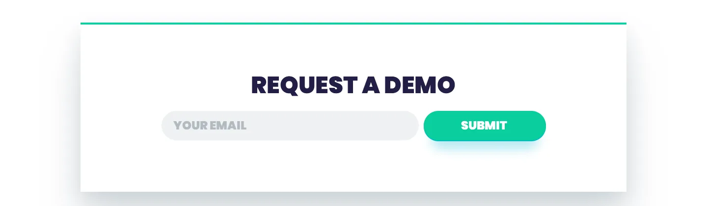
In its place went a “Request a Demo” box, and we argued for one field only, the email address. Name, company and phone are things a salesperson can ask for in the follow-up. Every extra field in front of a demo request is a reason not to send it.
In the 2019 refresh the client’s own team simplified further. The redundant “Sign In” button in the hero went, leaving “Get Secure” alone. The row near the footer became three secondary actions, Demo, Call Us and Chat, and the floating chat bubble was removed from the homepage altogether.
Testimonials with a name, a company and a bad day
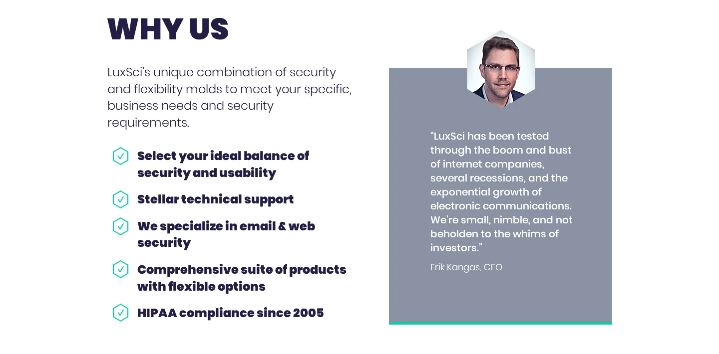
The “Why us” section went through small edits that add up. The bullets were made bold. Erik asked for “We specialize in email and web security” to become “Email and web security specialists”, which would make the list read as qualities instead of a mix of sentences and labels. He also noticed that the big green quotation marks behind the testimonial text competed with the words.
The page uses two kinds of proof. One is a quote from the CEO himself, in a card next to the bullets. The others are customers, each with a real name and company.
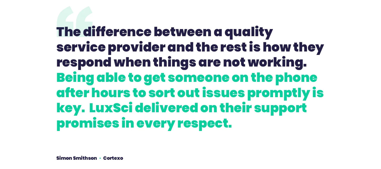
The best one is not about features at all: “The difference between a quality service provider and the rest is how they respond when things are not working. Being able to get someone on the phone after hours to sort out issues promptly is key.” It is from Simon Smithson at Cortexo, and it is the right testimonial for this product. Someone choosing an email provider does not worry about the good days. They worry about the night the mail stops. When you pick testimonials, pick the ones about the day your buyer is afraid of.
A checklist instead of a definition
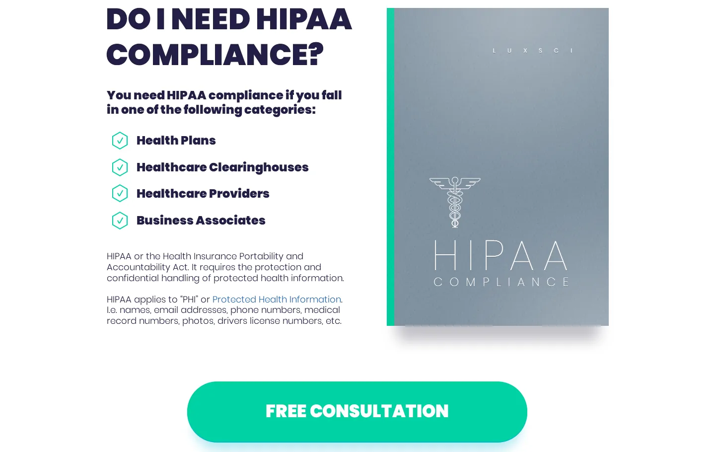
HIPAA is the reason anyone is on this page, and it is a hard thing to explain. The page does not start with the definition. It starts with a question, “Do I need HIPAA compliance?”, and answers it with four lines: health plans, healthcare clearinghouses, healthcare providers, business associates. Only then does a short paragraph say what the law is and what counts as protected health information. A single button follows, Free Consultation, and three guides sit below it for people who want to read first: Website Basics, Email Basics and Bulk Email Basics.
The order is the point. A visitor who is not covered by HIPAA finds out quickly and leaves without wasting anyone’s time. A visitor who is covered has just qualified themselves, and the next thing on the screen is the button that talks to a person.
The illustration took longer than the layout
Our estimate for the homepage was 10 to 20 hours, a finger-in-the-air number made before any 3D work was in the plan. The client agreed to start at 15. Eleven days later he raised the weekly limit from 20 hours to 30, noting that the hours billed were higher than he expected for a single page. That was fair. We had priced a layout, and what we were making had crossed from modern into a premium look that should last five years or more with small changes.
Most of the extra time went into one picture. The plan was a laptop with a HIPAA seal, surrounded by routers, firewalls, servers and envelopes. The render engine crashed repeatedly.
Padlock icons for each service looked repetitive, so we switched to glass cubes, which we called diamond cages. The client’s favorite was the version with two laptops, because it gave a better sense of connection and collaboration. We spent about seven hours a day on it over a weekend and a Monday, and billed 10 of those hours.
One idea did not survive.
We had wanted to show the real customer portal in the pop-up service menus, with the relevant parts highlighted, because proof beats adjectives. Recording the interface and cutting clean GIFs would have taken more time than the budget allowed, so we dropped it and kept the illustrations. It would still be the first thing we would add back.

A design is not finished until someone else can build it
Erik writes his own front end and back end, but he planned to hand the HTML work to a freelancer and use Bootstrap. So the handoff was part of the job. The home page went over as a 32 MB layered file with the hover states already set up in layer groups. A second file covered the complex sections at phone size. One rule was fixed from the start: text stays text, set in Poppins from Google Fonts, with no words baked into images.
The service sections were the tricky part, so we built them ourselves instead of leaving them to guesswork. Each one uses a sprite image with two states, light for normal and dark for hover, plus an overlay for the icons. We coded a working version on CodePen with the animations, a slow half-second fade on hover, and comments for whoever implemented it. The reason was page weight: one sprite loads faster than many separate images.
The first freelancer was slow and we said so to the client directly. By the end the code was fine, with a few typos and small fixes. For cases like this we also offered a second document, step-by-step fixes with actual code and screenshots, in case the implementation drifted.
When the client’s team wants it flatter
In late 2019 LuxSci came back to refresh the first screens of the homepage below the menu. Their marketing team had made new mockups, and the first version had no call to action and no place for customer logos. The second version added both, with a single button, “Get Secure”. We sent a first version a week later.
The reply from the team asked for something much softer: one font, a tight palette, flat colors with no shadows, no aquamarine, more contemporary images for the logos. We pushed back, politely. The whole site had been built on a bolder style with shadows, and every page was designed with that system in mind. Changing one section would make the rest look inconsistent. We pointed out that design books say to warn clients about style inconsistency before it is too late, and offered to do the flatter version as a test.
Erik settled it the next day: “Let’s do your design (at least for now) with these tweaks.” The tweaks were all good ones.
No redundant Sign In. “Trusted by” instead of “A few of those…”, because the page never mentioned 2,500 customers before the logos, and a big number means something different in B2B than in consumer products. The light service boxes were cut because they added clutter. We then sent a version with no aqua, and Erik said he liked it better. He turned it into HTML himself in the interest of time, and it was live on the site the day after.
He did say he missed two taglines the new layout had pushed out, “The Responsible Choice” and “Be Smart. Be Secure.” The next day we pointed out a spacing issue and a stretched image. The stretching turned out to happen in Chrome and not in Firefox.
What the long tail looked like
The first contract ran from June 2018. In September 2020 Erik asked whether we had room for a website redesign for his brother’s financial company. In November 2022 the contract was closed with a five-star rating from LuxSci. In July 2023 he wrote again, asking whether we still had the vector originals of the logo, so LuxSci could make SVG versions. We did, in a logo file saved alongside the original page design, and sent them by email.
That is a better measure of a redesign than any single launch number. The site did its job for years, the client kept coming back, and he sent us someone else. One of LuxSci’s own customers, Kevin Rasmussen of keoscientific.com, puts the result in their words on the page: “I am extremely satisfied with your security features and with the extent of knowledge of your support staff. You provide a solid, reliable service and also, manage to continue to add more thoughtful features, all at a reasonable price.”
Thinking about a HIPAA-compliant redesign of your own?
If any of this sounds familiar, a service list nobody can explain, a pricing page that is not converting, a compliance section that reads like a legal notice, we will look at your current site and tell you what we would change. Free.