Category: Case studies

Medical Practice Website Design: Spine Clinic Case Study

The problem: A spine clinic needed a brand and a website for a fixed $2,500, and its visitors range from scared patients to surgeons who notice every anatomical mistake.

The fix: A logo built on a metaphor instead of bones, a homepage that answers a patient’s questions in order, a second-opinion page that explains a hard process in three steps, and a budget we stated up front and reopened the moment the scope changed.

In short: Medical practice website design on a fixed $2,500 budget means pricing the scope, answering a patient’s questions in order, and saying so in the same week when the scope moves. All the designs were approved by December 31, and the client said again how great everything looked.

Team
Alla and Ivan
Client
Joe Consedine
Dates
Oct 2024 to early 2025
Budget
Premium
Spent
$2,500 fixed
Done in
72 days to approved designs
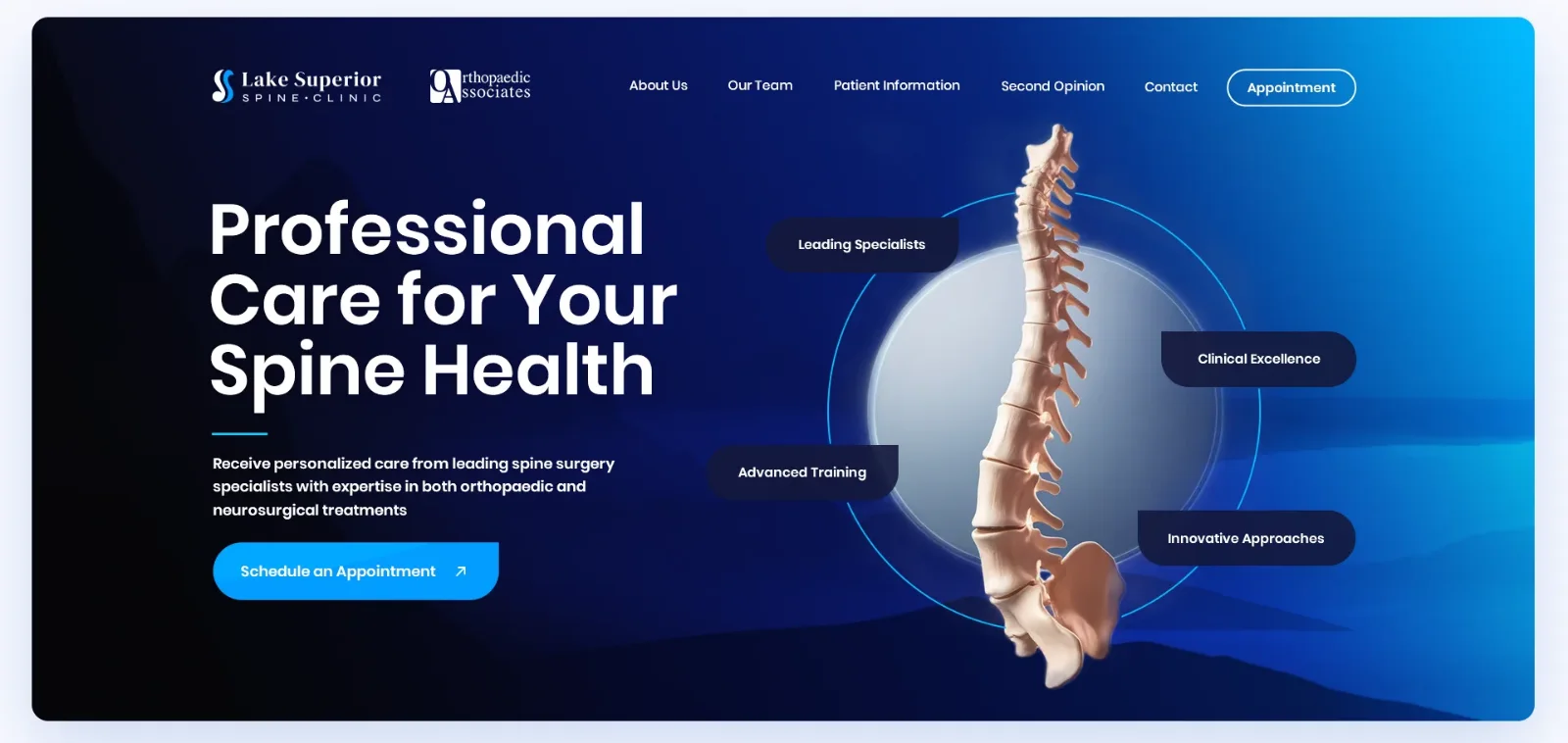
Medical practice website design: hero of the Lake Superior Spine Clinic homepage with the headline Professional Care for Your Spine Health, a 3D spine inside a circle and four floating labels
The hero: one headline, one button, and the spine as the single picture.

This is a medical practice website design case study from October 2024 to early 2025, for Lake Superior Spine Clinic in Duluth, Minnesota. We worked with Joe Consedine, who managed the project for the clinic and its surgeons. The brief covered branding, the homepage and four more pages, designed first and built in Webflow after approval.

Medical Practice Website Logo: Why We Avoided Bones

Clinics near this one wear the same logo: a spine here, a tooth there, drawn in a hurry. We wanted to escape that. Joe sent the branding outline on October 20, and our concepts followed on November 1.

We avoided bones on purpose. A literal vertebra in a logo looks like student work from the 1990s, and the great brands never draw their own parts: Microsoft does not put a motherboard in its logo and Apple does not put a hard drive in its own. So we used metaphors the clinic can own. The shape of a spine as an S curve. A circle that reads as a lake seen from above, because the clinic sits by Lake Superior. A sunny day, and a calm symbol for health. Quick AI visualizations of our pencil sketches went to Joe, as sketches only, so he could see the direction. None of them went into the final work.

The clinic’s own logo was part of the header too. Joe asked for the Orthopaedic Associates of Duluth logo to sit beside the new one, the way another spine site he liked shows its partner’s logo. On the day the brand board arrived, November 24, he passed on the client’s wish for a firmer font, and we reopened the type.

Medical Practice Website Budget: $2,500, and What Happened When the Font Changed

The fixed number was set on day one. Joe told us $2,500 was the most he was authorized to spend for the client, and asked us to confirm that the deliverables we had discussed still fit it. We confirmed, and designed to that number.

Read more

Comparison Website UX Redesign: CDNfinder Case Study

The problem: CDNfinder listed 35 CDN providers on one crowded page, the purchase form was long, the page loaded slowly, and almost nobody clicked the provider cards below the first screen.

The fix: Analytics and session recordings before any layout, then a homepage that works like a tool (filters first, short cards, vector graphics) and a separate quote page for the providers whose prices cannot be public.

In short: A comparison website UX redesign starts with data, not layout. Our audit found a page that took more than 12 seconds to load and heatmaps showing that nobody scrolled to the provider cards, and the client sent a new offer on the day the contract closed.

Team
Alla and Ivan
Client
Bart Pluskota
Dates
Mar 14 to May 9, 2018
Spent
$11,900
Client rating
★★★★★ 5.0: “You Get much more than what you pay for!”
Comparison website header illustration for CDNfinder: three stacked tracks with identical features and different prices
The isometric header illustration for CDNfinder.

This is a comparison website UX redesign case study from March to May 2018. We worked for Bart Pluskota, who ran CDNfinder at Zerouno, on the visual design, the illustrations and the landing pages of a platform where companies discover, compare and buy CDN services. Bart’s own developers built it, and we coached them on the design files.

Comparison Website Audit First: A Slow Page, a Long Form and Two Missing Tools

Our first message was a list of questions, not a mockup. Does the purchase page really need that many form fields? Why does the page download so slowly? We also said the page was too crowded for the 8 to 15 seconds a casual visitor gives it. Bart’s answer on the form was practical: the fields were compulsory because the purchase flow ran on WHMCS, and customizing it would cost them the system’s updates.

He wanted more purchases of CDN plans, more requests for CDN assessments, and information that was easier to read. The contract allowed up to 10 hours a week. Our first estimate was 20 hours or more, about $2,000 at today’s $100 an hour, and a few months before A/B tests would say anything, longer with little traffic. With small traffic we suggested bold tests: three buttons for two weeks, one button for the next two.

Before drawing anything we asked for two tools, Hotjar and Google Analytics access. Our reason, in the chat: “those are my eyes, without them we have just ideas, not data”.

Comparison Website Heatmap Findings: Nobody Scrolled to the Provider Cards

Within hours the data was uncomfortable. Direct traffic was poor quality. Organic visitors bounced, and so did returning visitors, which pointed at the page and its message and not at the traffic source. After only 39 recorded events (a small sample, and we said so) the heatmap already showed that nobody clicked the cards below the first screen. A week later the pattern held: nearly all interactions happened in the first screen, a few at the footer, and almost nobody touched Compare.

Read more

Physical Product Landing Page Design: Ö.Wall Case Study (Öopenspace)

The problem: A modular, adaptable wall system has no shelf in any store. It is not furniture and it is not architecture, so a landing page template has nothing to copy from.

The fix: Borrow an explanation format buyers already trust, and cut the content down for an eight-second scan. The 3D work still went over budget, and below is where.

In short: Physical product landing page design for a product with no category works when you borrow a format buyers already trust and cut the content for an eight-second scan. By January 13, 2023 the desktop, tablet and mobile versions were about 95% finalized, and the client wrote that the page looks amazing for what went into it.

Team
Alla and Ivan
Client
Aaron Teo
Dates
Dec 2022 to Jan 16, 2023
Spent
$5,000
Done
All delivered Jan 16
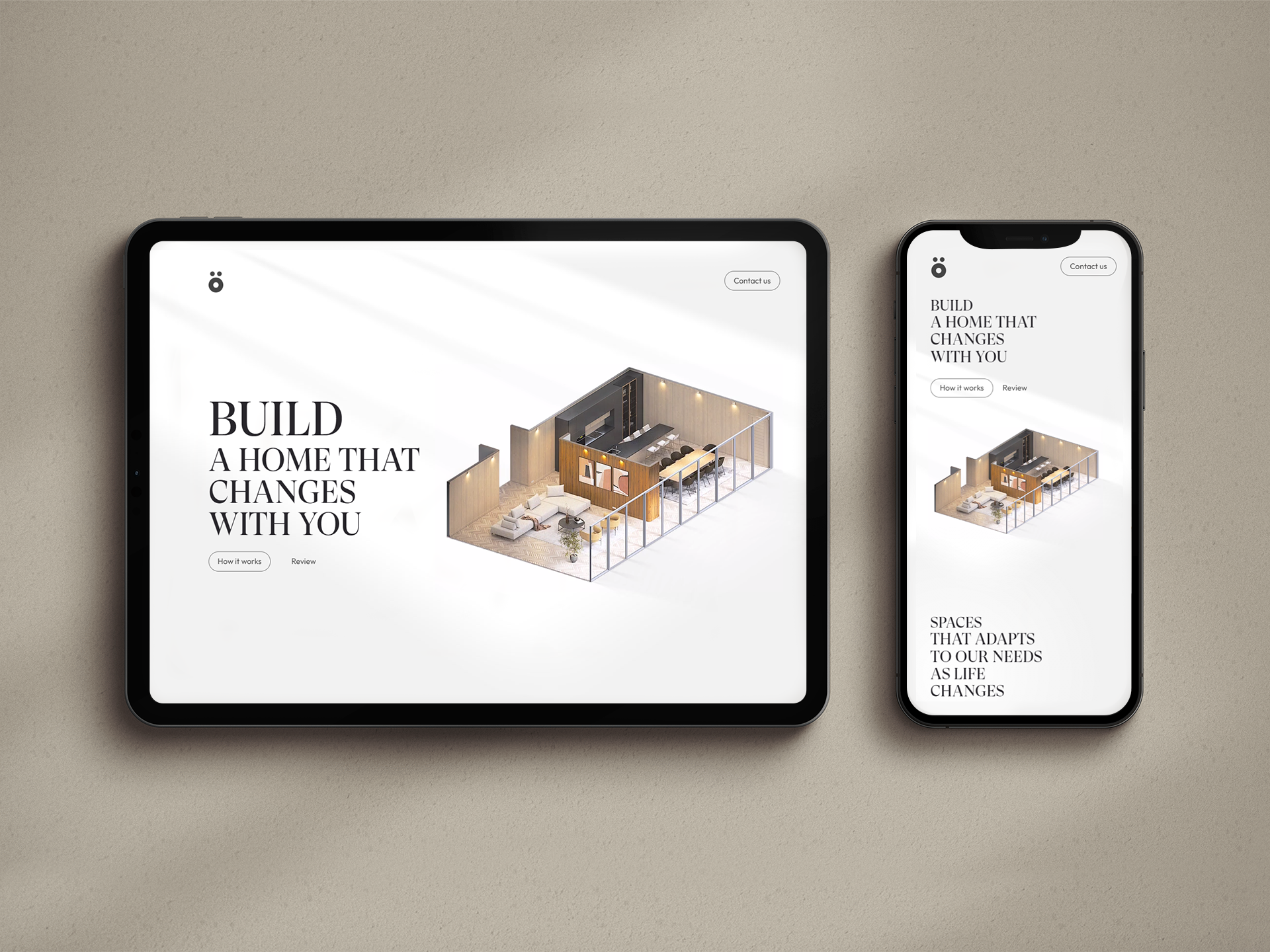
Physical product landing page: the Ö.Wall hero with the headline Build a home that changes with you, on a tablet and a phone
The Ö.Wall hero on a tablet and a phone.

This is a physical product landing page case study built around isometric 3D illustrations and a scroll-driven exploded view. We did the landing page design for Ö.Wall, a modular interior wall system from Öopenspace (our portfolio lists the project as ö.Space), working directly with Aaron Teo, who ran the project on their side. The budget did not go the way a tidy case study would show, so this one includes the overrun.

Physical Product Landing Page Design: Borrowing a Format Buyers Trust

The job post set the ambition: “We are a startup having to create a new innovative product that will revolutionise how we build and live.” That is hard to design a page around. So Aaron pointed at examples instead of describing the product. Apple’s product pages, for the scroll-driven exploded view. A site called Atmos as a second aspiration. And in our first conversation he added a feel: Aesop, warm and textural.

The product had no category to borrow credibility from. The explanation format did.

AIDA Landing Page Structure for an Eight-Second Scan

Aaron’s deck ran to at least twelve slides, with a companion app and a market story on top of the product itself. We told him that visitors have maybe eight seconds to scan a homepage. People who like what they see will read everything, but most only scan. So the content had to shrink to three or four sections, ordered by AIDA: attention, interest, desire, action. Attention comes first, and the explaining waits.

The page does this early. Three small illustrated houses state the problem in a line each: our lives change but our homes are static, we compromise on spaces that do not suit us, and we get no value from the most expensive thing we own.

Then come the choices a homeowner has today, each with a price and a time. Renovating runs $30k to $180k or more and six to twelve months. Building runs $180k to $500k or more and a year or two. Selling and moving starts around $500k. Rows of short tick marks make the comparison readable before a single sentence is.

Read more

HIPAA-Compliant Website Design: What We Changed on LuxSci’s Homepage

The problem: LuxSci sells HIPAA-compliant email and hosting, and its old homepage buried that under jargon, a hero video that looked spammy, and call-to-action buttons you had to hunt for.

The fix: Plain service names, one main button, a single-field demo form, and a header illustration that shows an idea instead of listing features. We worked on the site on and off for five years. The last message came in July 2023, asking for vector files of a logo we had drawn in 2018.

In short: HIPAA-compliant website design is mostly about what a visitor understands in the first seconds. We renamed the services in plain words, cut the demo form to one field, opened the compliance section with a question, and worked with LuxSci for five years, closing with a five-star rating.

Team
Alla and Ivan
Client
Erik Kangas
Dates
Jun 2018 to Nov 2022, with a refresh in 2019 and logo files in 2023
Budget
Premium
Spent
From $1,500, with the estimate at $1,000 to $2,000
Client rating
★★★★★ 5.0, contract closed Nov 2022
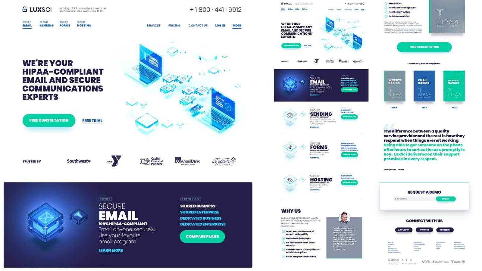
HIPAA-compliant website design: the LuxSci homepage with the hero, service sections, why us, testimonial and demo request on one page
The LuxSci homepage design on one page: header, services, why us, a customer quote and the demo request.

Most guides to HIPAA-compliant websites stop at the legal layer: encryption, signed agreements, audit logs. Those matter, but a visitor never sees them. A visitor sees whether the page makes sense in the first few seconds. This is a HIPAA-compliant website design case study, the landing page design side of the LuxSci project, from our own messages with the client: what we changed, where they pushed back, what went over budget, and what we would do differently.

Landing Page Audit Before the Redesign: Hero Video, Hidden Buttons, Clutter

The first thing we sent LuxSci was not a mockup. It was a written list of what was wrong with the existing homepage, and it was blunt. The hero video, with animated characters explaining the product, felt “like a spammy landing page designed to grab fast cash for a few days and vanish.” The calls to action were there but you had to play what we called a pixel hunt game to click one, because an unnecessary slider sat in the way. The page was crowded, and weak contrast and small type did not help.

Then we wrote the goals on one line: more visible calls to action, less friction, less clutter, better copy. We looked at about a dozen providers from LuxSci’s own competitor list, Hushmail for Healthcare, Paubox and Virtru among them, to see what the category already looked like. And we rewrote the homepage copy in a shared document before anyone opened Photoshop. Words and layout first, colors after. A text document is the cheapest place to disagree, and Erik Kangas, LuxSci’s CEO, could read it and comment on it from day one.

Read more

Chat With Us

We usually reply within an hour.
On busy days – 24-48 hours

To schedule the work, start an hourly contract on Upwork
(set a 10-20h weekly limit, pause anytime), or send a message or email us

View our Upwork profile

Our email…