


The problem: An Australian company that helps creators remove stolen content from the web needed a landing page for a new web app. The quote said eight hours. The page grew to thirteen sections, and the budget became part of the project.
The fix: We designed the page in Figma, built it in Elementor on a copy of the client’s site and added restrained motion after launch. This case study covers the choices that mattered: the message, the pricing section, the colors, the cost and the animation.
In short: A premium landing page comes down to one clear sentence on the first screen, a pricing section when the reader is not the buyer, restrained motion, and an estimate that gets revised when the scope grows.
- Client
- An Australian service that removes stolen creator content (name withheld)
- Work
- Landing page design in Figma, mobile version, Elementor build, animation
- Time
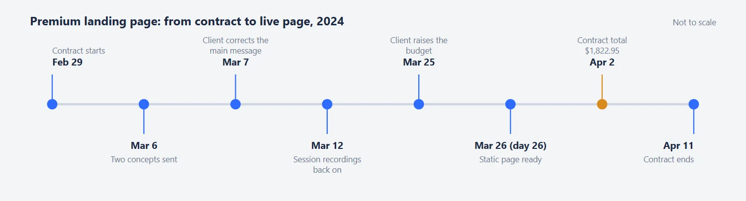
- February 29 to April 11, 2024
Contents
The quote said eight hours. The page had thirteen sections. This is a premium landing page design case study from 2024: a page for a web app that scans the internet for a creator’s stolen content and has it removed, designed in Figma, built in Elementor and finished with animation. Here is what we decided with the client, and what it cost.
Premium Landing Page Design: Starting From the Client’s Favorite Page
The client had one favorite landing page, the feature page of a task management tool, and he said so more than once. A favorite is a starting point. Copy it too closely and you get a page that looks like somebody else’s. So we sent a short Google Doc with likes and dislikes, and used the answers to move away from the reference in the right direction.
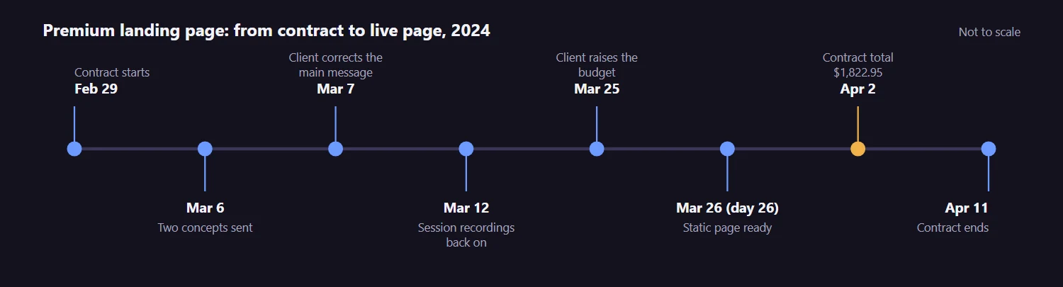
We also asked for analytics, and the answer was awkward. Session recordings had been switched off about six months earlier, so the history was useless. The client turned them back on on March 12, almost two weeks into the job. Traffic was a blank too: the page was new and its marketing had not started. Our rule of thumb is that below about a thousand visitors a day you get two to four big A/B changes a year, so decisions have to rest on reasoning more than on tests.
He left the content and layout to us and promised not to scrap the first draft. We guessed the content from the brief. He later said the guess matched about 85% of what he had in mind.
Landing Page Design for a Web App: Say What Happens Without the User
The missing 15% was the main message. Our first draft read like a tool where you submit links. The client corrected us on March 7: the platform scans for stolen content on its own, a trained team removes it, and the creator can log in to watch progress without lifting a finger. A visitor who wants a hands-off service should see that on the first screen.
He also wanted visitors to know it runs in a browser and is not an iOS download. We kept a phone in the hero, because we guessed most visitors would arrive on mobile. He called it a fine choice.
One idea did not survive. We wanted to replace an old-style web form with a box where people paste the bad links, so they have something to lose before the sign-up. The platform could not take links on the page yet. The sign-up stayed off the page, and the top button takes no input. Every mention of a free trial came out as well, because the service does not offer one.
Landing Page Pricing Section: On the Page, Not on a Separate Page
The client asked a direct question: pricing on the landing page, or a separate pricing page between the landing page and the sign-up? We said put it on the page, reached by an anchor link. The reader may be a manager who wants to forward the page to whoever pays. Visible prices read as transparency, which helps when you are cheaper or give more than the alternatives. And a page that already carries social proof can carry a price too. He agreed.
The pricing was a plain subscription with discounts for longer terms, with no bronze, silver and gold tiers. We showed the saving next to each longer term.
Domains were a different question, and we were less sure. If the services will mix later, we said, keep everything on the main domain. If the audiences differ completely, use a separate one. He knows his niche and we do not, so the call stayed with him. The page ended up on the company’s main site, and the app got its own domain.
Landing Page Color Scheme: Defending the Rainbow
We sent two versions on March 6, a less colorful one and a “fancy colorful” one. The client picked the colorful one the next morning. A week later he was “not 100% sold on the rainbow”.
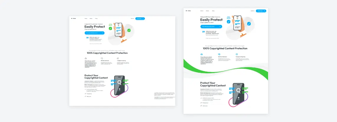
Our argument was about the audience. We guessed it would lean female, and a dry gray-and-blue corporate look would not suit it. We also skipped the purple and pink that every site for that audience uses. The rainbow works as a memory hook too: someone who cannot recall the name of the site remembers the rainbow. That is a hypothesis, not a measured result, and his doubt was fair.
The existing site felt to us like the 2000s and a little gloomy, but a full restyle was not in the budget. A good illustration takes three to five hours, so we kept the fresh style we had built and put the effort into illustrations instead. One small detail: rather than the complicated Australian flag, we used a single Commonwealth Star and the flag’s colors. It says Australia without limiting the service to Australia.
Landing Page Design Cost: Eight Hours Quoted, More Delivered
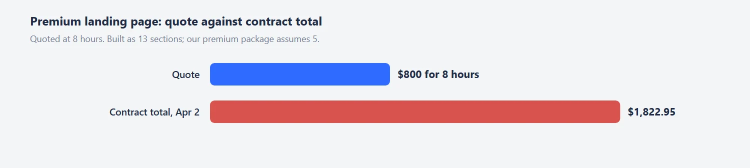
Expect this section to matter if you hire a designer for a long page. The client’s quote was $800 for 8 hours. Our estimate said at least 7 hours per design, maybe more, and that copy, coding and the mobile version were separate. The page had thirteen sections. On March 25 the client wrote that he was concerned about the budget. A day later the time log stood at about 15 hours, with 2 to 3 more needed for mobile. By April 2 the contract total was $1,822.95.
| Item | Quoted | Actual |
|---|---|---|
| Design hours | 8 hours ($800) | About 15 hours logged by March 26, with 2 to 3 more for mobile |
| Sections | 5 in our premium package | 13 |
| Copy, coding and mobile version | Written down as extra | Mobile needed 2 to 3 more hours |
| Animation and bug fixes | Not quoted | Not billed |
| Contract total on April 2 | $800 | $1,822.95 |
He was calm about it and said he believed the page would pay back, but he had a budget and KPIs to answer to. That is a fair position, and the miss was ours. We had written down that copy, coding and mobile were extra, but a note in a chat is not a revised estimate. Our premium package is built around five sections. When the page grew to thirteen, we should have sent a new number and waited for a yes. We did not bill the animation or the bug fixes. That softened the total and did not fix the process.
If you are planning something similar, how we work and what it costs lists what an estimate covers, and the price calculator gives a first number.
Landing Page Animation: Static First, Motion After Launch
The client had a phone call with a journalist on Thursday morning, Australian Eastern time, and wanted a link to send afterwards. That set the order. The static page was ready on the evening of March 26, 26 days after the contract began. We had warned him that if time ran out we would use images instead of live text on mobile, and replace them with a proper structure afterwards. He set the page to draft until his settings were done, and published it himself.
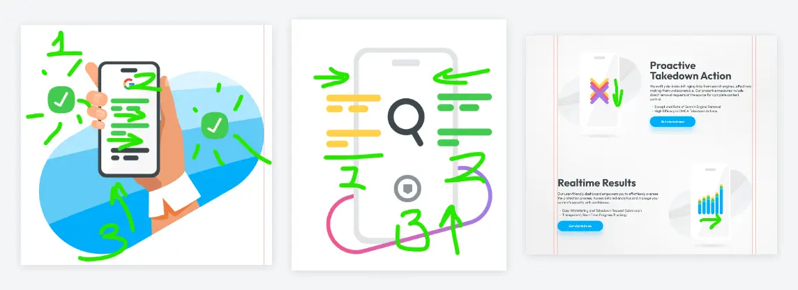
We planned the motion on the illustrations themselves, with numbered green arrows. Shapes grow and rise, a red mark turns green, a rainbow is revealed gradually, the letters AI change color from top to bottom. Ivan, who focuses on illustration and animation, helped with parts of it. Each loop is small. By our estimate they add 1 to 4 percent to the size of the static images, and the client’s only condition was that they must not slow the page. After the first video he called the style non-invasive and said it felt like a premium animation.
The first animated version did not play on the site. The cause was a bug in how the SVG files went into WordPress, fixed on April 10. On April 11 the client swapped the pages: the animated copy took the main address, and the static one became a draft. The FAQ stayed open with no accordions, because we do not like making people hunt for clickable pixels.
Elementor Landing Page: From Figma to the Live Site
The client’s site runs on WordPress with Elementor, so “coding” meant a visual editor and small CSS fixes. We built the page on a near-identical local copy of the site, then moved it section by section to the live server. The header and footer took the longest to match. At one point Elementor Pro turned out to be inactive on the live site. The fix was to log in to the Elementor account and pick the right domain.
Real traffic found two things we had not tested. The page looked wrong in the Instagram in-app browser, where much of the audience would arrive, and the same bug showed in other browsers too. We fixed it on April 11. We also suggested removing heavy scripts or loading them after the page, since speed affects conversions, and he said he would optimise them.
By April 29 the client wrote that everything looked good. In the months after, he sent us more pages to improve. For a landing page designer that is the best review there is.
Tips From This Project
Use these on your own premium landing page:
- Send the client a likes-and-dislikes sheet next to the favorite page they name.
- Ask for analytics first. Recordings from before a long pause tell you nothing.
- Write the one sentence the first screen must say before drawing anything. Here it was: it works without you.
- Put the price on the page when the reader may not be the buyer.
- Say in writing what is outside the estimate, and send a new number when the section count grows.
- Ship the static page first and add motion after launch. Check the page weight.
- Test in the Instagram in-app browser if your traffic comes from social media.
- Keep an unpublished duplicate of the page for edits before you replace the live one.
Planning a Premium Landing Page?
If you have a product, a page and an estimate that keeps growing, send us the brief. We will tell you what the page needs and give you a number before we start. You can also look at a smaller version of the same approach in our physical product landing page design case study.
Frequently Asked Questions
Read next
Sales Page Design for a Health Product: What We Changed. A first screen with the offer in it, honest reviews and a guarantee block.
Landing Page Design Process: How We Work and What It Costs. The steps, the estimate and what each one includes.