


The problem: You need a landing page for a local service, a driving school in this case, you have a small design budget, an existing brand with bright colours, and a client of your own who wants to see options before they decide.
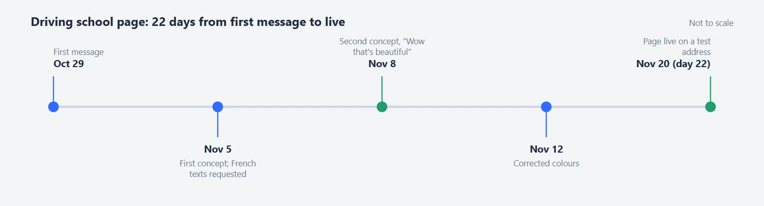
The fix: Collect references first, ask your client for a budget for illustrations, and agree what “use our colours” means. This driving school landing page design guide comes from a project in October and November 2019 for a freelancer who was building a French-language driving school’s web presence for his own client. We went from first message to a live Unbounce page in 22 days.
In short: Driving school landing page design starts with references from the same niche and the real copy. We went from first message to a live page in 22 days, and the client wrote “Wow that’s beautiful.”
- Client
- A freelancer building a driving school site
- Dates
- Oct 26 to Dec 2, 2019
- Budget
- Essential
- Done in
- 22 days
Contents
Driving School Landing Page Design: Collect Seven References From the Same Niche
On the first night we set the order: start with the landing page, and if help with strategy is needed later, hire us for that, since perhaps half of those strategies can be found free online. The next day we sent a document to fill in and a mood board built from seven driving school sites, including schools in Manchester and Maastricht and a school called A to Z, chosen for layout and content, not for look. The client liked the mood board and said it “can take a few days” to talk to his client.
Driving School Landing Page Design in French: Get the Real Words First
The first concept arrived on November 5, and we asked at once for the French texts, because the length of words matters for the design. Draft English labels hide the problem: translated labels run longer, and a button that fits “Book now” may not fit its translation. The client promised the corrected text for Friday.
Illustrations or Stock Photos: How to Spend a Small Budget
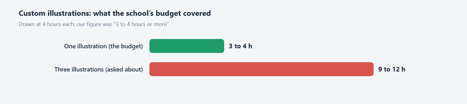
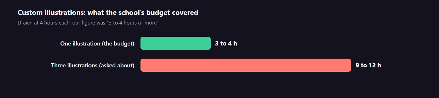
A custom illustration takes 3 to 4 hours or more, and a landing page can carry one to three. He asked whether three would be enough, then told us the school’s budget covered no more than one. Stock photos were fine, and the page became photo-led. If your budget is small, decide the number of custom illustrations in the first week: it is the line that moves the price the most.
Landing Page Colours: Matching a Brand Without Copying the Bright Version
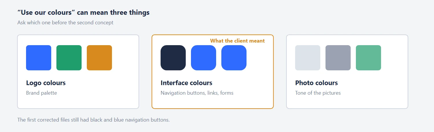
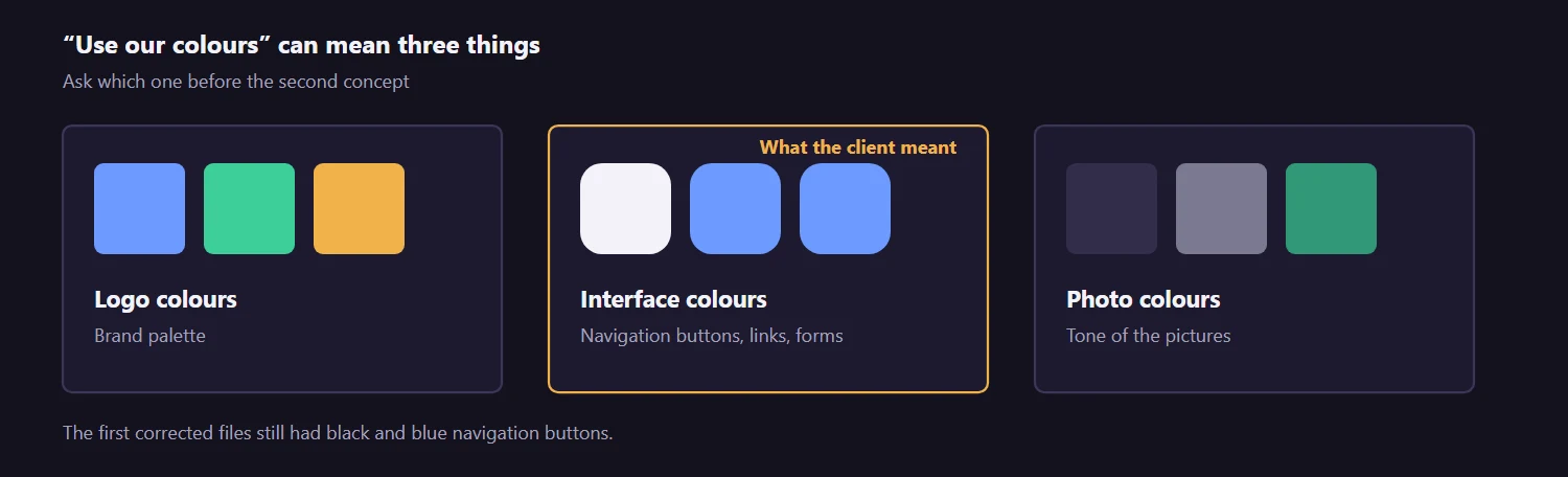
On November 8 the client’s client asked to see the page in the colours of the current site, without illustrations, but not the exact colours: they were too flashy, bright and glossy. We delivered two files within hours and he wrote that it was beautiful. He then pointed out that the navigation buttons were still black and blue, because he had meant the interface colours and not only the picture. A corrected version followed on November 12. When someone says “use our colours”, ask whether they mean the logo, the interface or the photos.
Driving School Landing Page Design in Unbounce: Going Live and the Payment Form
On November 20 the page was live on a test address. Two gaps needed content from the client: a link to the company video for the block below, and text for the form. The form redirects to a thank-you popup, and the school’s developers can insert custom HTML with an iframe in Unbounce to process credit cards. A landing page should hold the form and leave the payment data to a payment provider.
What the Client Said About the Work
He liked the mood board at once: “Mood board looks great.” On November 8, 2019, when the second concept came in, he wrote: “Wow that’s beautiful. Thank you so much. Love it!”
What went well: two concepts in a week, a live page 22 days after the first message, and a client who could see his own colours in the layout without the glossy brightness he disliked. One lesson: when you work through a freelancer or an agency, feedback arrives twice removed, which adds days to a short project.
Tips From This Project
Use these on your own driving school landing page design:
- Collect 5 to 7 references from the same niche.
- Send the real copy in the real language before layout.
- Decide how many custom illustrations you can pay for. Stock photos are a fine default.
- Clarify “use our colours”: logo, interface or photos.
- Prepare the video link and form text early. They are the usual reason a page waits.
- Take card payments through a payment provider’s form, not your own field.
Planning a Landing Page for a Local Service?
Ask us about your driving school landing page design. If you sell lessons, appointments or courses to local customers, send us your current page and what you charge. We will look at the first screen and the booking form and say what we would change. You can also see what a landing page project costs before you write to us, or see how we approach landing page design.
Read next
Medical Practice Website Design: Spine Clinic Case Study. A local service, a booking button and a three-step process page.
Comparison Website UX Redesign: CDNfinder Case Study. A quote page for a marketplace.