

The problem: Your SaaS homepage hero explains the product with a big illustration and a repeated pitch, and you want to feature a new product without changing the look of the site. You also need to test headlines, and the product itself lives behind a login.
The fix: Make the hero show the product, test two headlines on short pages in a landing page builder, and settle in advance who gives access to the app’s code. This SaaS hero section design guide comes from a redesign for a crypto trading strategy platform in October 2024.
In short: Hero section design for a SaaS product works when the hero shows the product. We replaced an illustration with a search bar and delivered two Unbounce variants for a headline test within a month.
- Client
- A crypto strategy platform
- Dates
- Oct 2 to Oct 31, 2024
- Budget
- Popular
- Rate
- $100/h, 5 then 15 h/week
- Done in
- 27 days
The client wanted to redesign the homepage hero, feature a trading bot product and keep the look and feel of the site. A founder sent the offer, and a product lead took over the project on the client’s side on October 3. We delivered two Unbounce landing page variants in a month.
Contents
SaaS Hero Section Design: Show the Product, Not a Green Hole
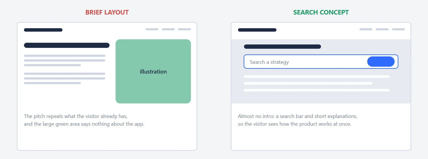
The brief came with a layout. We made an almost identical version within hours of the offer, and added improved ones. Our objection to the original: it repeated content the visitor already had, and a large green area held an illustration that said nothing about the app. Our alternative looked like Google: almost no intro, a search bar and short explanations, with no duplicated content. The visitor sees how the product works at once. The search concept is the one that went into Unbounce.
Landing Page A/B Test: Two Headlines, Two Short Pages, One Long Page
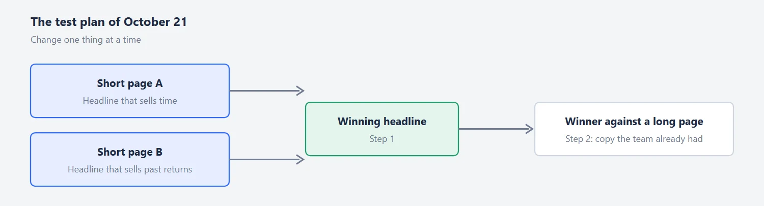
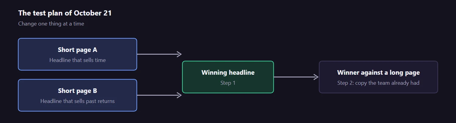
The product lead turned the choice into a test. His two headlines were “Save Time By Automating Your Crypto Trading” and “Try Our Proven Crypto Strategies With Historical Annual Returns of 40+%.” One sells time, the other sells returns. The plan on October 21 was to run two short pages, one per headline, against each other, and then the winner against a longer page with copy the team already had. That is a good structure: change one thing at a time, and compare a short page with a long one only after the headline question is answered. The second headline states a number about the past, and checking that number was the client’s job.
He also asked to remove the account number from a screenshot. A hero with a real product screenshot is exactly where such details leak.
Embedding an App in a Landing Page: The Access Question
The product search had to appear inside the Unbounce page as an iframe. We said at once that iframe into Unbounce is a typical task, and that the search form can sit inside the hero without a separate band. Tracking can run through Google Tag Manager or another third-party tool, and the lead took the iframe question to Unbounce. DNS was part of the setup, so we also wrote out the CNAME steps: open your DNS provider, add a CNAME record with the subdomain as the name and the target domain as the value, save and wait for propagation.
The hard part was styling. To put the search form and results table on the grey background from the concept, we needed access to the code of the search results page.
The lead expected the founders would not give it out. That left two workarounds without access: an iframe with a few hacks to hide the top of the app page, or screenshots of the product that behave like the real thing, so that a click on a screenshot or on the search form opens a registration popup. The two variants followed: in the first, clicking any screenshot opens a registration popup, and in the second the search form is replaced by a header with an illustration. We asked the client which converts better, a popup or a direct link to sign-up.
| Variant | What the visitor sees | What a click does |
|---|---|---|
| Variant 1 | Screenshots of the product that behave like the real thing | Opens a registration popup |
| Variant 2 | A header with an illustration instead of the search form | Question we put to the client: popup or a direct sign-up link? |
What We Delivered
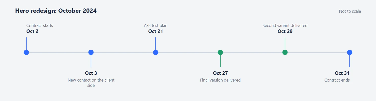
Within a month the client had two finished Unbounce variants for the test, built from the search-bar concept, with an answer for the embedded form. The product lead reviewed each stage with a recorded video of feedback, on October 8, 11, 21, 24 and 28. We delivered the finalized version on October 27 and a second variant on October 29.
Tips From This Project
Use these on your own hero section design:
- Show the product in the hero. A working search beats an illustration.
- Test one thing at a time: two headlines on two short pages, then the winner against a long page.
- Check the number in a headline before you pay for ads.
- Ask early who can give access to the code of any app you embed.
- If you can’t touch the app, use clickable screenshots that open a sign-up popup.
Need a Hero Section That Shows the Product?
Ask us about your hero section design. If your homepage explains a tool instead of showing it, we will look at your first screen and tell you what we would try. You can also see what a landing page project costs before you write to us, or see our landing page design approach.
Read next
Hardware Startup Landing Page Design: The Öopenspace Case. A first screen built to explain a physical product in eight seconds.
Comparison Website UX Redesign: CDNfinder Case Study. Heatmaps, provider cards and a quote page for a marketplace.