


The problem: A B2B software company in supply chain compliance sold to aerospace and defense procurement teams and sent prospects a PDF. It needed a one-page website at a fixed price in one week, built from a long slide deck.
The fix: We built the page around the three things its buyers check, cut the deck’s “how it works” walkthrough, redrew the diagrams as 3D and vector illustrations, and published it on Webflow with a lead form. The final page took eight weeks, not one.
In short: A one page website for a B2B product works when it answers the questions a buyer already has, drops the walkthrough and keeps the type large. Count the hours of every illustration before you promise a date.
- Team
- Alla
- Client
- A B2B software company in supply chain compliance (name withheld)
- Work
- One page website design in Adobe XD, 3D and vector illustrations, Webflow build, mobile version
- Time
- May 5 to July 1, 2021
Contents
The client asked for a one-page website in a week. It took eight. This one page website design case study covers a B2B software company’s landing page, drawn in Adobe XD with 3D illustrations and built in Webflow in 2021: what we cut, what it cost and what we would do differently.
One Page Website Design for B2B: Start With What Buyers Check
The client’s buyers, procurement people at aerospace and defense companies, mostly read a landing page and the LinkedIn profiles of the executives before they talk to anyone. So he wanted a one-page website instead of a full site. The brief was a slide deck, a short video, one simple reference site and a deadline of a week. The offer itself arrived as an hourly contract at $100 an hour with a limit of 10 hours a week.
We did not draw anything first. We sent a mood board document with twelve examples from Dribbble and Behance and asked him to mark what he liked and disliked, and to name his competitors. He filled it in the next day. He also sent his five customer personas and told us what those customers care about: that the company understands the problem of collecting data from suppliers, that its experts have real industry experience, and that the pricing is reasonable and fixed. The page skeleton came from that answer, with a “why us” block and an FAQ added later.
B2B Landing Page Design: Cut the “How It Works” Section
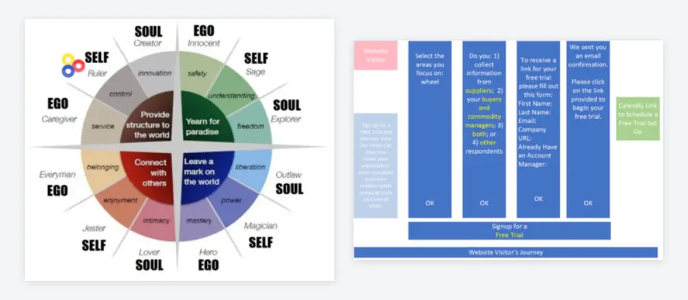
The deck was built around “how it works”: charts, flows and screens of the app. We asked a plain question: which reader should these slides convince? A CEO, management or an engineer? The deck spoke to engineers. It showed features, and a C-level reader wants results, with numbers, before and after, and value.
Our view was blunt. The screenshots of the software looked dated, and nothing on them explained why it beats a spreadsheet. Our first layout removed the whole walkthrough, and the client agreed. The experts slide, which he called the most important one, got its own section. For a possible second version we suggested separate landing pages per role, each with fewer sections.
The same logic hit the company history. The first draft carried a paragraph per year. We cut the text of each year by half and then by half again, on a simple rule: before adding anything to a slide, cut two things. Our working assumption was that most visitors give a slide two or three seconds. Nielsen Norman Group’s analysis of one 2008 study of 25 users puts the share of text read on an average page at about 20 percent. It is an old and small study, so read it as a direction, not a law.
The client pushed back on one thing, and he was right. Without customer logos the first fifteen years of the history looked as if the company had none. We put a compact logo row after 2020 and separated customers from the one certification with a line.
One Page Website Design Cost: Five Sections Quoted, Eight Built
On May 21 we had to talk about money, and the conversation was not comfortable. Our numbers were $900 for design, $100 for extra edits of the experts section, and $500 for the basic structure in code, rising to $1,000 with interactive elements and a mobile version. That is up to $2,000 for the whole page. The client had thought the entire price was $1,000.
| Item | Price | Note |
|---|---|---|
| Design in Adobe XD | $900 | Eight sections built, five were estimated |
| Extra edits to the experts section | $100 | Quoted on May 21 |
| Coding the basic structure | $500 | Webflow |
| Coding with interactive elements and a mobile version | up to $1,000 | Depends on the interactions |
| Whole page | up to $2,000 | The client had expected $1,000 |
Our argument was scope. The original estimate assumed five sections, and the page had eight, plus 3D illustrations that counted as three more sections of work. We had already coded half the page, and the prices were mid-range for the market. We told him he could get cheaper from students or new freelancers. He kept reviewing, and the work went on.
The mistake was ours, and it is an ordinary one. We started coding and drawing before the number of sections and the price were agreed in writing. A fixed price in a week only works when the scope is fixed first. If you are planning a similar page, how we work and what it costs lists what an estimate covers.
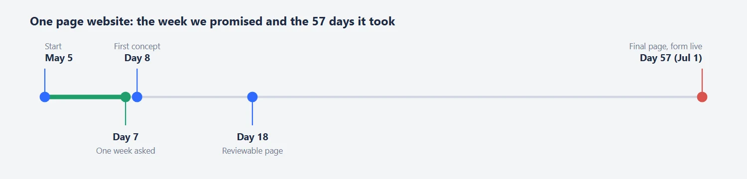
The deadline went the same way. The first concept came on day 8, a reviewable page on day 18 and the final page on day 57. We had five to eight contracts running in parallel and worked weekends, and each illustration took two to three hours or more. The client asked how things were going several times, politely. In early June he said the sales team was still sending prospects a PDF.
Website Design for an Older Audience: Bigger Type, Fewer Words
Many of the buyers were over 50, and in June the client told us so while looking at a draft: the lettering was too small. We enlarged the type, and where a label no longer fitted, we rearranged the blocks. For a slide he needed in front of a prospect the next day, we sent several versions with bigger text and he picked the second.
Our test for any slide is to step back one or two meters from the monitor and try to read it. If you cannot, cut the text. The same slide in a pitch deck and on the website do not need the same type size, and we set them separately.
Color was a smaller argument. We had arranged the persona colors by the order of the spectrum. The client explained that his team uses the colors to segment prospects: green means someone is searching for a solution right now, red means they have no clue, pink means they do not care. We cut it down to three states so a reader could take it in at a glance.
One disagreement stayed open. We had made the text in a product screenshot small on purpose, to keep attention on the button. On July 1 the client said it could not be read. We still think a screenshot is decoration, but with this audience we should have shown him the size first.
Landing Page Illustrations: What Each One Took in Hours
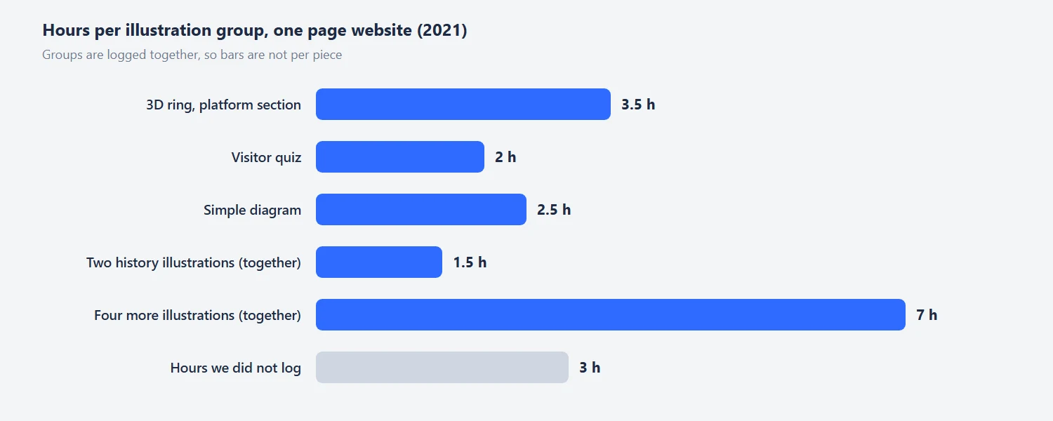
The expensive part of the page was illustration. The 3D ring on the “our platform is comprehensive” section took 3.5 hours. The visitor quiz took 2 hours, and the two history illustrations 1.5 hours together. A simple diagram took 2.5 hours. Four more illustrations took 7 hours together. Three more hours we did not log at all.
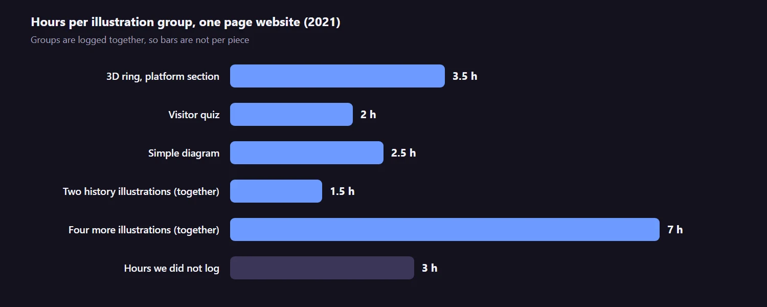
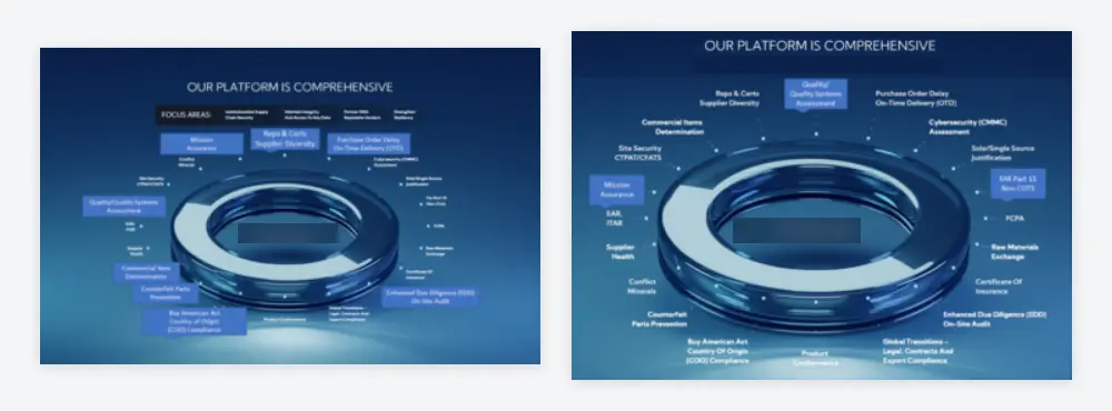
We priced everything in hours so the client could choose. The history section showed why. People icons for every year looked simple, but making each person look different, with their own glasses, notebooks and ties, would have taken more than five hours. We kept them almost identical.
Photos of the company’s experts were another small job. The only source was LinkedIn, where the images are too small for a page, and for a retina screen you want twice the size. We enlarged and retouched them with an AI upscaler and asked for high-resolution originals. One expert’s photo was missing, so a placeholder stood in until it arrived.
Webflow Landing Page for Mobile: From 2 MB to 200 KB
Webflow’s free plan does not allow custom HTML and CSS, so on May 18 we asked the client to buy a site plan. It cost $16 a month, and he bought it that evening. We built the page there, section by section, and shared a link at every step.
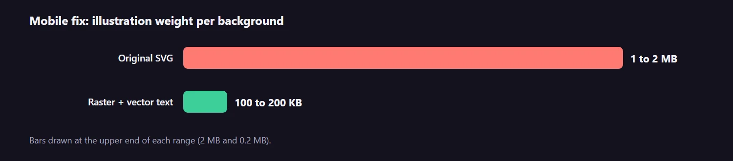
On June 29 we rebuilt the mobile version. The original illustrations were SVG files of 1 to 2 MB each. That is fine on a fast office connection and slow on 4G. We redrew each background as a raster image of 100 to 200 KB and placed vector text over it, with a grid for four screen sizes. We offered the client three ways to do it. One merges everything into a single image, which is cheap and editable only in Adobe XD. The second keeps vector text over a raster background. The third positions text over the image so it can be edited in Webflow. For simple sections we used the third. For complex ones the first was the default.
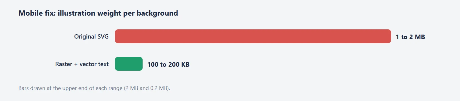
Fonts gave one more surprise. Webflow would not load Google Fonts inside SVG files, a cross-origin limit, so we converted the text to outlines. On July 1 the lead form was collecting leads, and we added a white paper block and some animations for free. On May 23, when the first working version went up, the client had said it looked “really, really good”.
Tips From This Project
Use these on your own one page website:
- Ask what your buyers check before they call, and build the page skeleton from the answer.
- Fill in a mood board together before the first sketch, with likes and dislikes.
- Replace a feature walkthrough with results, and cut two things before you add one.
- If the audience is over 50, test the type size on a real screen from a meter away.
- Estimate every illustration in hours. Ours took between 1.5 and 3.5 hours each.
- Agree the number of sections and the price in writing before coding.
- Rebuild illustrations for mobile at 100 to 200 KB instead of shipping 2 MB files.
- Hand over the source files, so the client or another designer can edit the page later.
Planning a One Page Website for a B2B Product?
If you have a deck, a deadline and buyers who skim, send us the three questions they ask before they buy. We will tell you which sections the page needs, what it costs and how long it takes before we start. You can also see a smaller version of the same approach in our physical product landing page design case study.
Frequently Asked Questions
Read next
Sales Page Design for a Health Product: What We Changed. A first screen with the offer in it, honest reviews and a guarantee block.
Landing Page Design Process: How We Work and What It Costs. The steps, the estimate and what each one includes.