


The problem: A small online store sold a sleep product through a very long sales page. An outside reviewer had flagged missing trust signals and testimonials that were cut off, and the store needed a checkout and a thank-you page in the same style.
The fix: We redesigned the sales page around a first screen with the offer in it, reviews that include a few honest ones, a guarantee block, and a mobile layout that keeps the buy button in view. The checkout, with an express shipping order bump, and the thank-you page followed the same look.
In short: Sales page design for a health product comes down to a handful of decisions: what the first screen promises, which urgency signals to keep, how to show reviews, and where to put the refund terms. Here is what we changed and why.
- Client
- An online store selling a sleep product (name withheld)
- Work
- Sales page, checkout, thank-you page
- Built with
- WordPress and Elementor Pro, by the client’s developer from our designs
- Dates
- 2022 to 2024
Contents
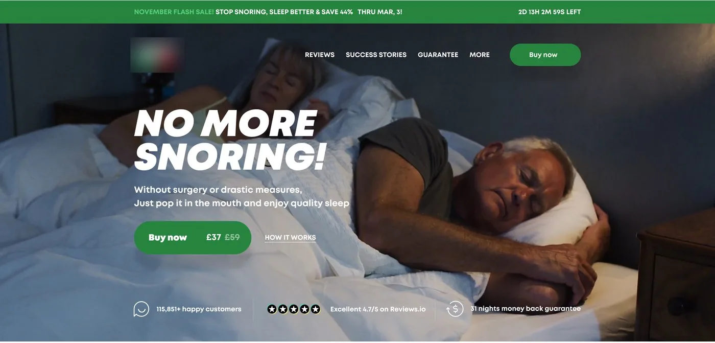
A long sales page lives or dies in its first screen. This is a sales page design case study for a health product, written from our messages with the client: what the page promised, which signals we kept off it, and what we did for phones. It is also the landing page design work we do for stores that sell one product.
Sales Page Design: What the First Screen Has to Do
The first screen has to hold the whole offer. Here the promise is the headline, the price sits inside the button next to the crossed-out old one, and a row below carries a rating, a customer count and the money-back guarantee.
The client had a blunt test for the button: squint until the page blurs, and if you cannot find the main button, the page fails. The play-video button, green on a green block, was the one that test flagged.
Phones made the rule stricter. The buy button has to be in view without scrolling on most devices, and the client’s fix was to trim a little off both header lines instead of pushing the button down. Cutting words is cheaper than losing the first tap.
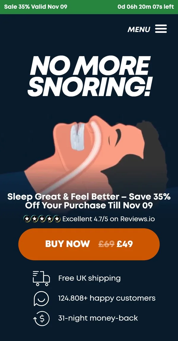
Product Page Design: Dropping Urgency You Already Show
Two things on the draft said the same thing twice. A “units left in stock” line sat next to a countdown timer. The timer already carried the urgency, so the stock line went.
Trust sits next to the action. On desktop the rating appears under every buy button, not only in the header, because that is where a visitor decides.
Ecommerce Product Page Design: Icons and Boxes Nobody Clicks
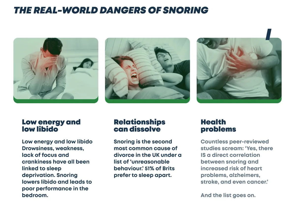
Click recordings changed one section. We had considered flip boxes for the three dangers of snoring, a pain on the front and a solution on the back. The recordings from the old page showed how little visitors click on elements like that, and flip boxes do not flip on a phone. The final page shows the three problems as plain cards with a photo, a heading and a short text.
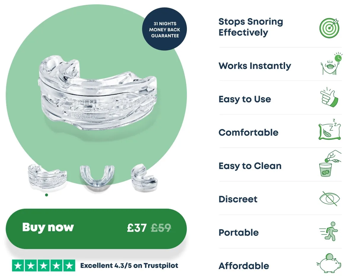
The benefit icons next to the device were the opposite call. The outside reviewer worried that icons are hard to read on a phone. We kept them decorative on purpose. Nobody reads icons, the text carries the meaning, and some of them would mislead if you took them literally. Our view then and now: they steady the composition and do not affect the sale.
High Converting Sales Page Design: Reviews With a Few Honest Ones
Reviews were the longest argument. We wanted to leave some one-star reviews on the page, because customers evaluate them before they buy and a page with only praise looks arranged. The client wanted balance: a bad review that ends with a fast refund is good news for a shop.
The middle way: the best reviews first, a few honest ones in plain sight, and everything else behind a link to the review site. The client also asked whether we could do without the review widget, so the shop controls its own text and an outside script does not slow the page. A fair question: every external script costs speed on a long page.
Sales Page Guarantee: Refund Terms After the Explanation
We placed the refund request steps after the “how it works” block, on purpose. A refund link next to the first button invites refunds from people who have not yet read how the device works.
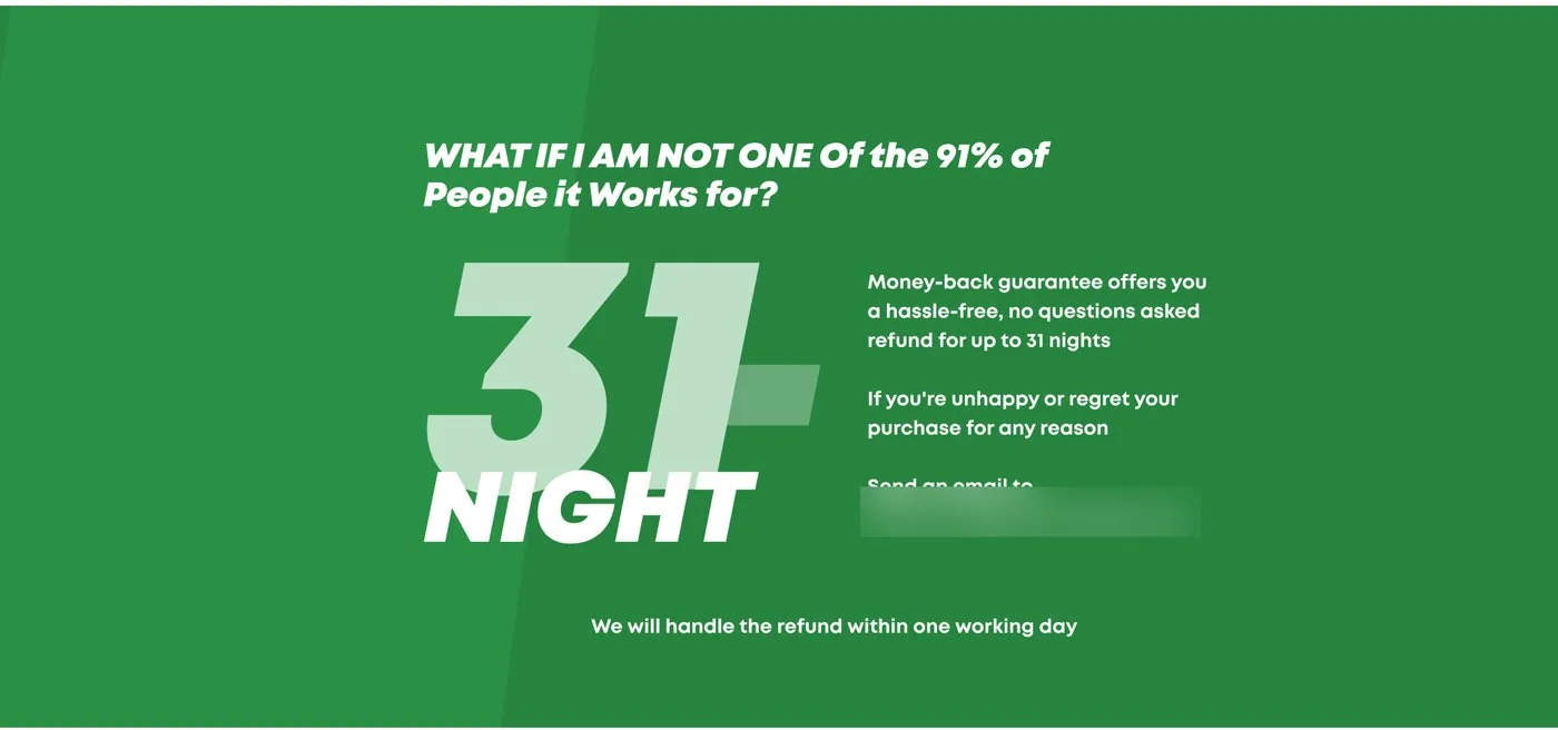
One line took a second look. The first wording promised help with a refund within a day. Then the client caught it: the shop cannot promise a refund in a day, because the customer has to send the product back. The page now says the refund will be handled within one working day, and the reader gets an email address to write to.
Sales Page Mobile Design: The Button Stays in View
Our first mobile layout did not fit every phone, and we say that plainly. The developer began with a media query for each screen size from a spreadsheet of devices, and text started to overlap. The better approach kept the video, the headline, the sub headline and the button in fixed places and let the type size follow the screen and the length of the text.
CSS already scaled most things. What it could not do was shrink a headline that ran past its reserved height, so a small script took care of that. Tablets needed their own pass. The padding before the buy button looked odd, so we asked for it to match the desktop version, and the developer fixed the menu for widths up to 1,200 pixels. We had also suggested scaling the desktop layout for screens near 1,000 pixels. Our rule for the last stretch was simple. Fix what blocks the sale first, ship, and polish the cosmetics after launch. Tests could still show that the version was not the best one.
How We Tested the Sales Page
We argued about statistics. A test with about 50 conversions tells you little, and we would want far more, a thousand or so, before a firm conclusion. The client’s answer was practical: someone selling a 10k course does not have a thousand conversions to test every block either. Once the page breaks even, the ad budget grows, and the data grows with it.
So the plan was modest. Launch one page, build a second version of the sales page for an A/B comparison, change one block at a time. Speed got its own pass: media cleanup, caching and a test of the page on dedicated servers. Length was not the culprit, since the old page was twice as long.
The result that mattered to us was not a number. The page went live, and in November 2023 the client asked us to adapt it for a second site for the US market. In March 2024 the client came back with a sales brochure for a consulting job. A client who returns twice has told you what they think.
Tips From This Project
Use these on your own sales page:
- Put the price, the button and a few trust signals on the first screen.
- Squint at your page. If the main button disappears, change its color or its contrast.
- Drop urgency you already show elsewhere, such as a stock counter next to a timer.
- Replace anything that needs a click with a static version when recordings show nobody clicks it.
- Show a few honest negative reviews after the strongest ones.
- Put the refund steps after the explanation, add an email address, and promise only what you control.
- On phones, fix the position of the button first and scale the type to fit.
- Read a small test as a hint, and change one block at a time.
Planning a Sales Page Redesign?
If you sell one product and your sales page does not move it, send us the page. We will look at it and tell you what we would change first. Free. You can also check what a sales page like this costs before you write to us.
Frequently Asked Questions
What should be on the first screen of a sales page?
A promise in the headline, the price next to the buy button, and a few reasons to trust the offer, such as a rating and the guarantee. On a phone the buy button should be visible without scrolling on most screens.
Should a sales page show negative reviews?
We argued for keeping some one-star reviews so the page does not look polished to the point of doubt. The client wanted a balanced mix, and a bad review that ends with a quick refund is good news for the shop. Best reviews first, a few honest ones in view, the rest behind a link: that was our middle way.
Where do you put the money-back guarantee?
Show the guarantee badge near the buy button, and put the refund request steps in a block after the explanation of how the product works. Give an email address and promise only what the shop controls. On this page the promise is that the refund is handled within one working day, and the email address is right there.
How do you test a sales page with few conversions?
Treat a small test as a hint, not a verdict. With about 50 conversions we would not decide anything big. Test one page against a variant, keep the ad budget growing so the data grows, and change one block at a time.
What is the difference between a sales page and a product page?
A product page is a catalog card for one item among many. A sales page is a long page built to sell one product: it states the problem, shows the proof and repeats the buy button.
Read next
HIPAA-Compliant Website Design: 7 Lessons From a Real Case. Plain service names, a one-field demo form and an isometric header, over five years with one client.
Physical Product Landing Page Design: Ö.Wall Case Study (Öopenspace). A launch page for a product with no category: an AIDA structure and isometric 3D illustrations.