


The problem: Two clients had sites that did not turn visitors into signups. A wedding marketplace startup in New Zealand saw people drop out of onboarding. An online high school in Ontario had a landing page that buried ten years of results.
The fix: We ran a website UX audit for each: a quick review of the live pages in 2017 and a landing page audit with a redrawn layout in 2019. One client moved on to wireframes. The other built the new page from our files.
In short: A good audit ends with a ranked list of fixes, not a new look. Read the analytics first, keep proof above the fold and test the structure before you pay for visual design.
- Clients
- A wedding marketplace startup and an online high school (names withheld)
- Work
- Website UX audit, landing page audit, wireframes, mobile layout, Adobe XD and PSD files
- Time
- November 2017 and October 2019
Contents
Both of these clients asked for one thing: tell us what is wrong with our site. This website UX audit case study covers two of them, a wedding marketplace in 2017 and an online school in 2019. It shows what we checked, what we sent back, what each audit cost and where we got it wrong. Most audit write-ups skip the last two.
Website UX Audit: What We Check in the First Hour
A first look at a site takes about half an hour, and it tells you most of what is broken. The wedding marketplace was in beta. Its founders could not validate the idea because people left before finishing onboarding, and they said so plainly. Their hiring process was a trial: two freelancers, one hour each, a review of the site with onboarding in focus. The rate was $50 an hour with a limit of two hours a week.
Our notes were in the chat within about thirty-five minutes of accepting. The home page text was hard to read against its background. One button said “Learn more” and promised nothing. Some text was so small that a visitor would simply close the tab. A dense block of copy sat where most people scan and scroll, and nobody scans a wall. The blog had about ten broken pages and a Pinterest-style grid, and the posts ended without a next step, so a reader arriving from search had nowhere to go.
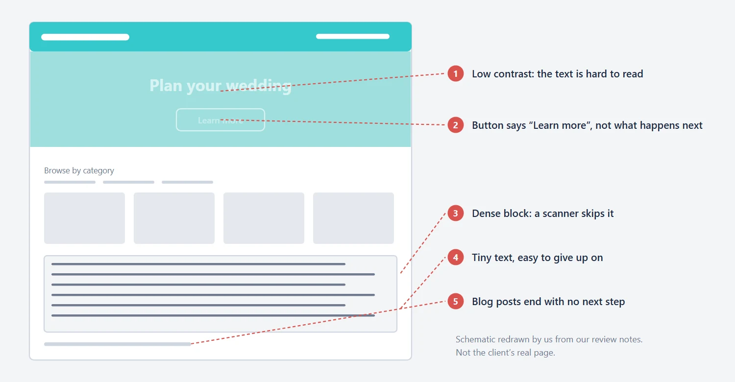
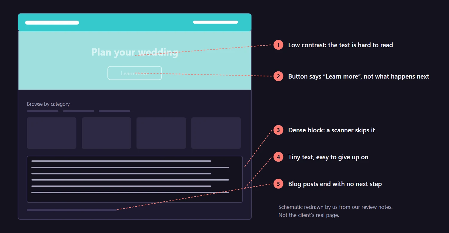
We also sent two reference sites and a link on social proof. Real photos of real couples, from public profiles, would do more for trust than any tagline. The client agreed with most of it and said the team had already been looking at several of the points.
Mobile Website Audit: Read the Analytics Before the Layout
Mobile was worse than desktop, and the client knew it. We found the home page slow in Google’s PageSpeed Insights and the mobile layout confusing. The client opened access to Google Analytics, Hotjar and Fullstory, plus a trial of Mouseflow. Session recordings showed desktop visitors giving up at the login step, and mobile visitors giving up earlier.
The numbers had one flaw: the team’s own visits were in them. The developer, the founders and the freelancers they had hired to review the site all counted as users. We asked the client to exclude those IP addresses, and he did, which meant starting the count again with clean data. Nielsen Norman Group’s analysis of one 2008 study puts the share of text read on an average page at about 20 percent. It is an old, small study. It still matches what the recordings looked like.
Website Onboarding UX: Wireframe First, Then Test
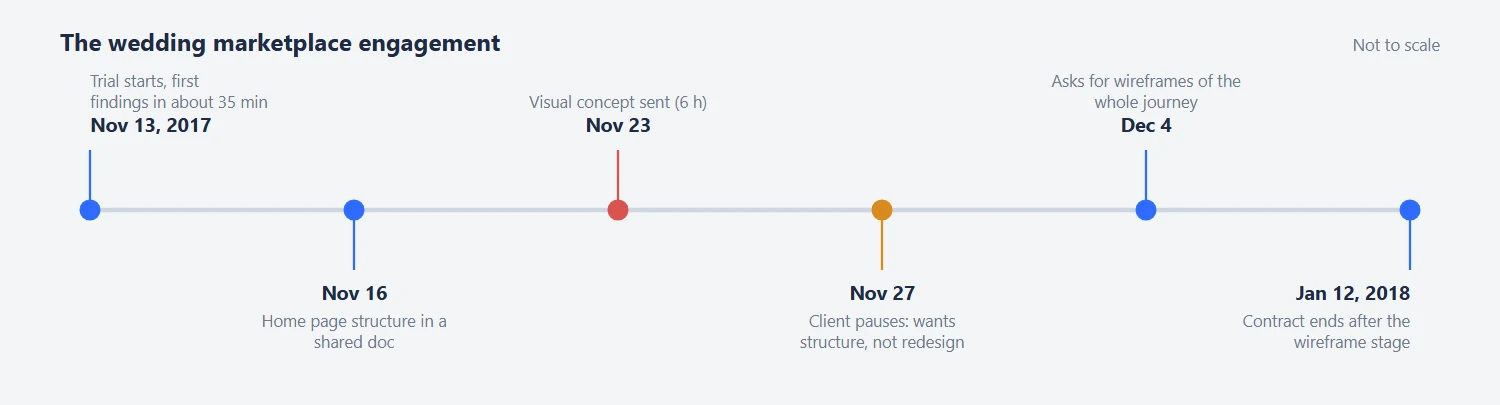
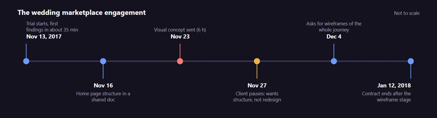
The first mistake was ours: we jumped to visuals. We wrote the home page structure in a Google Doc, as tables and plain text, so the client and his copywriter could edit it. That part worked. Then we went further and drew a full concept in Photoshop, about six hours of work, with a floral frame and hover effects on the links.
He paused the contract. A complete redesign was not what he wanted. He wanted the cause of the onboarding problem, a recommended page structure and the user flow, with the existing design reused so that his developer would not rebuild everything. We had answered a question he had not asked.
The second slip was advice. To test the new page we said he would need at least a thousand visitors, and a startup in beta did not have them. We suggested a hallway test instead: show the page to people from the wedding world, on forums or in person, before any code. He liked it. He also decided to test the whole journey rather than each page, because speed to market mattered more than a clean experiment.
His next request was wireframes for the entire flow, desktop and mobile, with three new features built in: price indicators, ratings with reviews and a vendor availability calendar. He wrote that the structure came first, and that he thought we had done a “fantastic job on the landing page”. The contract ended in January 2018, once the wireframe stage was over.
Landing Page Audit: A $250 Review That Grew to $550
The school started with a smaller budget and a tighter question. The offer on October 18, 2019 was $250 for one milestone: audit the landing page only, on desktop and mobile. The client had a test site with the future design and the old site next to it. He said plainly that nobody on his team was a designer and that engineers and developers were ready to build whatever came out of the audit.
We accepted on October 22 and sent the first findings the same afternoon. Both versions looked dated. The layout did not adapt to a large display. Contrast was poor in the sections that mattered most, and those sections were crammed together. The goal of the page was new registrations, and the page did not know that. His first answer was brief and cheerful: “we have thick skin”.
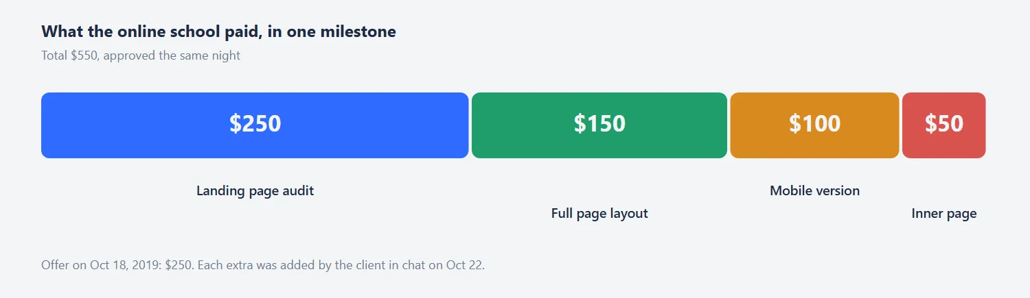
The client could say what felt wrong, but not how to fix it, so we drew it. Within about two hours we sent a proposed layout for the first screen. Then he asked for more, and added $150 to go down the whole page. Mobile was another $100. An inner page template, like the school’s story page that is mostly text, added $50. By 9:30 that evening he had approved the milestone at $550 and we had sent an Adobe XD file, and a PSD converted from it for developers who do not use XD.
Landing Page Redesign: Put the Proof Above the Fold
The old page made visitors dig for the facts that sell a school. It said it was founded in 2010 and had over 3,000 students, in a paragraph under a long menu. We moved those two numbers into a row right under the first screen, next to a third one, the speed of earning a credit. The client added an idea of his own: a counter animation like the one on a Michigan virtual school’s site. We said yes.
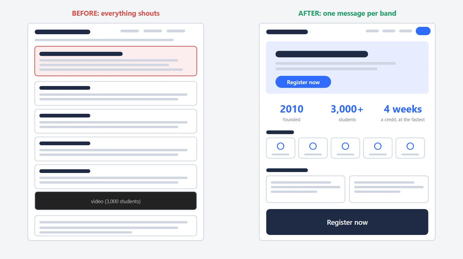
Other changes were quieter. The hero video, which was long, became a short clip of about thirty seconds that plays on mute and still makes sense without sound. The cartoon icons gave way to simple line icons from a free set, because he did not like the cartoon look and neither did we. We used large type on purpose, so the page holds up on a big monitor and a small laptop. For mobile we only redrew the header, testimonials and the “who we are” block. Columns collapse into a single stack on their own in any grid system.
On November 19 he asked us to look at his developers’ version of the page. It was cleaner. We asked for more white space between sections, 100 pixels or more, one typeface family instead of three or four, and a fix for a 40-pixel hover jump in the staff section. That last one is the kind of detail an audit cannot predict, and a review after launch catches.
Website UX Audit Checklist: Eight Questions a Visitor Asks
Every finding above answers a question a visitor asks without knowing it. We keep these eight in front of us during the first hour. They are a short version of the ten usability heuristics from Nielsen Norman Group, rewritten as things a visitor would say.
- Can I read this? Check contrast and text size on a real phone, not in the design file.
- What is this page for? Ask someone who has never seen it, five seconds in. Their answer beats ours.
- Can I trust it? Real numbers, real people, something checkable online.
- What happens if I click? A button says the action: “Register now”, not “Learn more”.
- Does it work on my phone? Run PageSpeed Insights on the home page and look at the mobile score first.
- Can I sign up without effort? Count the steps and fields between the first screen and a finished signup.
- Where do I go after reading? Blog posts and inner pages need a next step.
- Is the data honest? Remove your own team from analytics before you read any chart.
Number seven was the cheapest fix on the wedding marketplace: a line and a button at the end of each post. Number eight cost the client a week of fresh data.
Website Audit Cost: What Each Client Paid
Here is what each audit cost and what it grew into. The wedding trial was one hour at $50, with the weekly limit raised to 5 to 10 hours as the work expanded. The concept alone took six hours. The school paid $550 in total, in one milestone that was approved the same night.
| Client | What was bought | Price or hours | When |
|---|---|---|---|
| Wedding marketplace | One-hour trial review of the site | $50 an hour, limit 2 hours a week | Findings in about 35 minutes, Nov 13, 2017 |
| Wedding marketplace | Home page structure in a shared document | Part of the hourly work | Nov 16, 2017 |
| Wedding marketplace | Visual home page concept (not needed in the end) | 6 hours | Nov 23, 2017 |
| Online school | Landing page audit, desktop and mobile | $250 | Findings on Oct 22, 2019 |
| Online school | Proposed layout of the full page | +$150 | Same evening |
| Online school | Mobile version | +$100 | Same evening |
| Online school | Inner page template, Adobe XD and PSD files | +$50 | XD the same evening, PSD after midnight |
| Online school, total | One milestone | $550 | Approved Oct 22, 2019 |
The pattern holds for most of our work. A short audit is cheap, a layout is a few hours and a coded page is its own project. Our landing page design process shows how we split these steps, and the price calculator gives a first number for yours.
Tips From These Audits
- Run the first look as a timed check of one hour, and write down the five biggest problems before anything else.
- Ask what the page is for, and judge every section against that one goal.
- Put your strongest numbers in a row near the top: years in business, students, customers.
- Draft the structure in a shared document before drawing anything.
- Ask in the first call whether the client wants a diagnosis, wireframes or a redesign. They are three different jobs.
- When you cannot get 1,000 visitors, test with ten people from your target audience.
- Send source files with the layout, so a developer can build it without calling you.
- Look at the built page once after launch. Small things like a 40-pixel jump only show up there.
Need a Website UX Audit?
If your site loses people before they sign up, send us the page and your goal. We will review the first screen, mobile and the path to signup, and tell you what to fix first and what it will cost. See our landing page design work for the kind of pages we build after an audit. Free, with a reply within one working day.
Frequently Asked Questions
Read next
One Page Website Design for B2B: A Webflow Case Study. What we cut from a sales deck and how long each illustration took.
Sales Page Design for a Health Product: What We Changed. A first screen with the offer in it, honest reviews and a guarantee block.