

The problem: A creator of online wellness courses had landing page sections drawn in Photoshop and handed them to an outside integrator to build in WordPress. The built page drifted from the design: wrong widths, uneven spacing, flat type.
The fix: We kept the sections as reusable blocks, answered the integrator’s questions about widths, colors and fonts, and then helped the client find and test a new developer with one short task.
In short: PSD to WordPress rarely fails in the code. It fails in the handoff: which file the developer builds from, how colors and type are written down, and who owns the details.
- Client
- A creator of French-language wellness courses (name withheld)
- Work
- Landing page sections as reusable blocks, header variants, ten more sections
- Built with
- WordPress, first with Thrive, then Divi, by the client’s developers
- Dates
- Spring 2019
Contents
Pixel-perfect is a promise that depends on what the developer is given, not only on the file. We learned that in the spring of 2019, on a set of landing page design sections for a creator of online wellness courses. This PSD to WordPress case study follows the file from Photoshop to a half-broken WordPress page, and then to a developer who came much closer.
The plan was a kit. A header, a section of overlapping pictures, a numbers block, a social proof block: pieces the client could assemble into new landing pages without calling us each time. He saw it on the first day.
From what I see, from what you have developped we have about the whole range of lego bricks that will make it possible to plug-and-play around to design the other landing pages.
PSD to WordPress: The 1400 vs 1920 Pixel Argument
The first fight was about a number. Our first files were 1400 px wide. The integrator built from them, and on April 2 the client, watching the page drift, asked for 1920 px versions. We sent them the same day. He wrote that the person building the site “can’t function” without the wide file, and that the 1400 px version was “killing us”.
We saw it differently, and said so bluntly. 1920 px is a width for large screens, and the client had told us that about 75 percent of his visitors came on phones, which means 375 px. A decent developer adapts a section to any width. Two-column sections took the damage first anyway, a text column beside overlapping pictures. They live on exact proportions of empty and full space, and those were the proportions that went.
It’s like all your design is lost. The worst is on the sections with 2 columns, 1 text – 1 overlapping pictures. All the padding and equilibrium goes through the window, it’s ugly where your stuff was balanced.
The client asked what many people ask: is this a WordPress limit, or one padding setting? Neither, in our view. But his complaint stood. The page he got did not match the page we drew, and the width was the one difference he could name.
PSD to WordPress Conversion: Colors and Type That Look Different
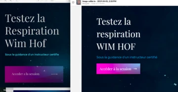
The integrator used the color codes from the file, and the page still looked different. The client was told that browsers display colors differently from Photoshop.
In the design, titles were dark and the body text was a thin, light gray. In the build, the body text looked as heavy as the titles.
As if we were writing on word bold times new roman font and copy-pasting.
A color code does not carry that contrast on its own. The handoff has to list color, font, weight and size together, for titles and for body text, and say which of them does the work.
Design Handoff to Developer: Spacing, Columns and Reusable Blocks
Then the spacing. Every title in the build sat a little differently, while the design followed one rule for the title block: the same gap between the top of the section, the title, the subtitle and the content. The client’s question was fair. Why not measure it once, save it as a template and reuse it?
Do-polish-record-replicate: Invest once, harvest ever after.
That is how he wanted to work from the start. He wanted to create a page alone: add a section, pick a ready template from the library, swap the picture and the text, turn two columns into three, and have it still work. A builder only allows that when the sections are saved templates and not copies made by hand.
I change my mind and transform 2 columns into 3, and it still works.
When the talk reached the question of staying with the first builder or moving to another, we gave a plain answer. Builders are good at simple layouts. A custom section can cost two to five times more time than the same thing built from native blocks, and this design was custom all the way through.
Convert PSD to WordPress: How the Client Tested a New Developer
After about two weeks of back and forth, the client started looking for a new developer. He ran the screening, and we gave our opinion on the candidates. His method is worth copying.
- Candidates who skipped the screening questions, did not work with a current Photoshop or showed only basic portfolios dropped out before any test.
- The test was one real task with a fixed time: about an hour and a half to code a hero section in Divi, as close to the file as possible and working on every screen size.
- He checked the code, the CSS and JS choices, the loading speed and the image optimization.
- He set the test on the hard version on purpose, to see how candidates adapt a section from the narrow file. Then he worried that a candidate might match the pixels and still be unable to adapt, and switched to the wide file.
We wish you the best of luck, are here cheerleading you and hoping you’ll do great.
The developer who took the job delivered a section close to the file on his screen, with a few glitches on the client’s. One limit came up: the large background lettering ended up on top of the photo instead of under it. He said so openly, which is what you want from a hire. This developer worked from the 1920 px file and came much closer. We still think the person mattered more than the file.
The Handoff Package We Would Send Next Time
The last problem was the file itself. The sections were spread over several PSDs, and the instructions read like “for the first section, see the fifth section of the second file”. The client put the order together by hand before the next developer started, and asked for one file with the right sections in the right order.
If we handed over this project again, the package would be:
- One file, sections in page order, each one named.
- The content column width written on the file, and a wide canvas for full-width backgrounds.
- Colors, fonts, weights and sizes in one table, for titles and for body text.
- The spacing rule for the title block, so it can be saved as a template.
- Image sizes and ratios, and what happens when a picture of another size is dropped in.
- A short list of what is decoration and has to be an image, not text.
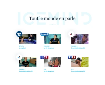
The work went on. A week after the new developer started, the client wrote again. He had new national TV coverage and newspaper articles and wanted the “seen on TV” block reworked to put them forward, as a band, a slider or a bigger set of pictures. Another section for the kit.
Tips From This Project
- State the content width, and send the wide canvas when the developer asks for it. It costs less than the argument.
- Write color, font, weight and size together, not the color code alone.
- Save the title block as a template once and reuse it.
- Build one section all the way, responsive and checked, before starting the next.
- Keep every section in one file, in the order of the page.
- Ask what a custom section costs in the builder before you draw it.
- Test a new developer on one real section with a fixed time.
- Check the finished page against the file on more than one screen.
Planning a PSD to WordPress Handoff?
If you have a design and a site that do not match, send us both. We will look at the gap and tell you what we would fix first. Free. For a long page that sells one product, see how we handled sales page design for a health product. To plan the budget, what a design project like this costs is in our calculator, and how to choose a website platform helps with the builder question.
Frequently Asked Questions
How do you convert a PSD to WordPress?
Set the colors, fonts and spacing once in the theme or builder, build each section as a saved template at the real content width, and check it at several screen widths before moving to the next section. Copying each section by eye and fixing it later is what makes a site drift from the design.
Why does my WordPress site look different from the PSD?
Common causes are a different canvas width, a color code that reads differently because of font weight, and spacing that was measured by eye. In this project all of these were in play, and the type contrast was the clearest one.
Should a mockup be designed at 1400 px or 1920 px?
Write the content column width on the file and send a wide canvas when the design has full-width backgrounds. In this project the integrator worked from a 1400 px file and the client asked for 1920 px. We held that a decent developer adapts to any width, but sending the wide file is cheaper than the argument.
What should a PSD handoff include?
The sections in the order they appear on the page, the color codes, the font names with their sizes and weights, the spacing rules, the image sizes and ratios, and one file with everything in one place instead of sections scattered across several files.
How do you test a developer before hiring one?
Give them one real section and a fixed time. Here it was about an hour and a half to code a hero section from the PSD, and the client then checked the code, the CSS and JS choices, the loading speed and the image optimization.
Read next
Sales Page Design for a Health Product: What We Changed. A redesign that kept the buy button in view and the reviews honest.
Physical Product Landing Page Design: Ö.Wall Case Study (Öopenspace). A launch page for a product with no category: an AIDA structure and isometric 3D illustrations.