

 Ivan
IvanThe problem: a modular, adaptable wall system has no shelf in any store. It is not furniture and it is not architecture, so a landing page template has nothing to copy from.
The fix: borrow an explanation format buyers already trust, and cut the content down for an eight-second scan. The 3D work still went over budget, and below is where.
We designed the launch site for Ö.Wall, a modular interior wall system from Öopenspace, working directly with Aaron Teo, who ran the project on their side. The budget did not go the way a tidy case study would show, so this one includes the overrun.
A product with no category needs a borrowed format
The job post set the ambition: “We are a startup having to create a new innovative product that will revolutionise how we build and live.” That is hard to design a page around. So Aaron pointed at examples instead of describing the product. Apple’s product pages, for the scroll-driven exploded view. A site called Atmos as a second aspiration. And in our first conversation he added a feel: Aesop, warm and textural.
The product had no category to borrow credibility from. The explanation format did.
Eight seconds, not eight sections
Aaron’s deck ran to at least twelve slides, with a companion app and a market story on top of the product itself. We told him that visitors have maybe eight seconds to scan a homepage. People who like what they see will read everything, but most only scan. So the content had to shrink to three or four sections, ordered by AIDA: attention, interest, desire, action. Attention comes first, and the explaining waits.
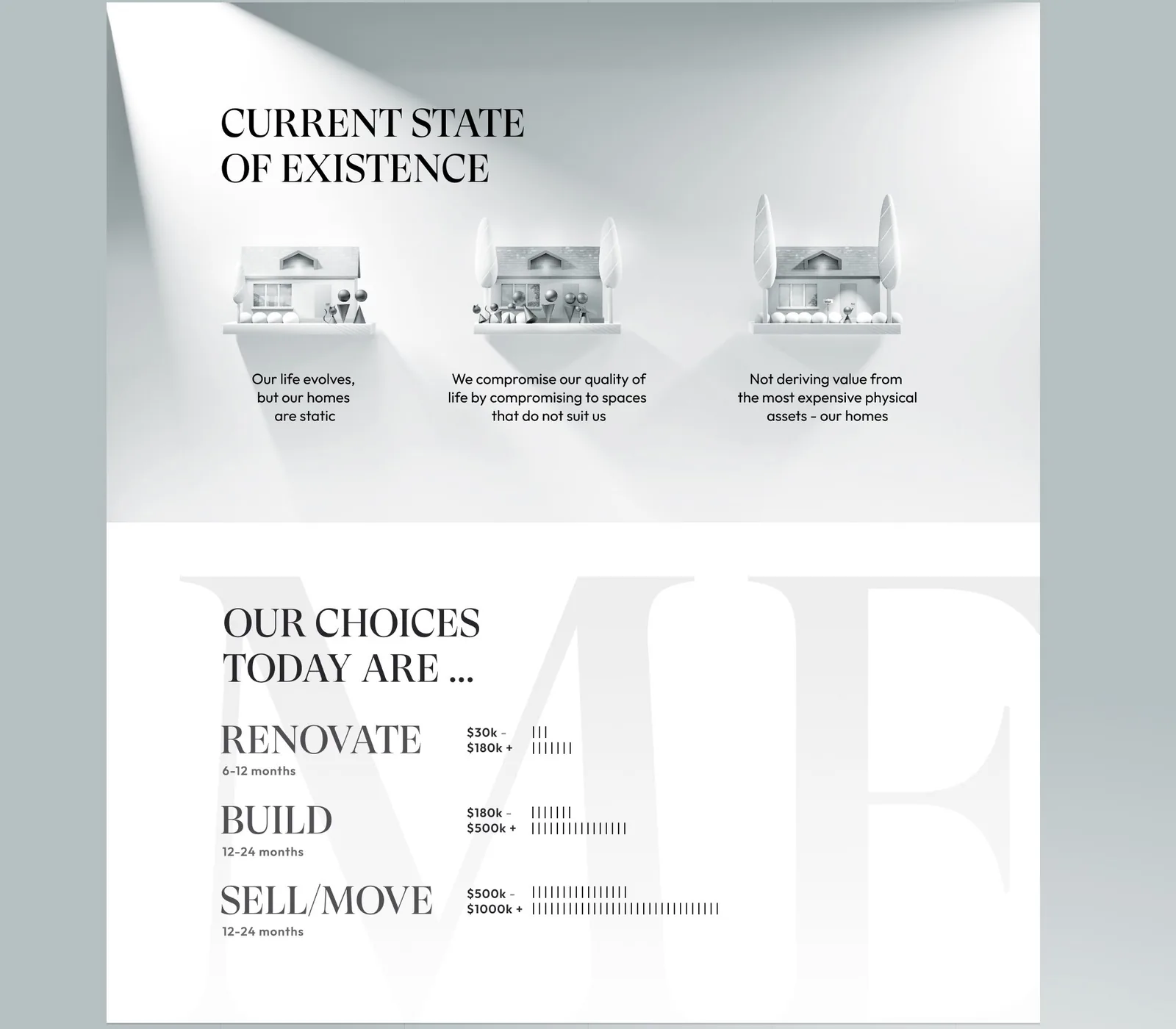
The page does this early. Three small illustrated houses state the problem in a line each: our lives change but our homes are static, we compromise on spaces that do not suit us, and we get no value from the most expensive thing we own.
Then come the choices a homeowner has today, each with a price and a time. Renovating runs $30k to $180k or more and six to twelve months. Building runs $180k to $500k or more and a year or two. Selling and moving starts around $500k. Rows of short tick marks make the comparison readable before a single sentence is.
The page also had to be mobile first, not mobile adapted afterward. A scroll-driven exploded view built for a wide desktop canvas rarely survives being shrunk down later.
The headline came last
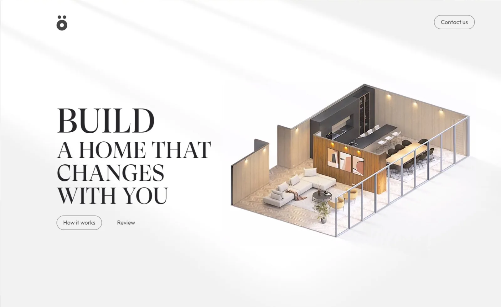
Early concept rounds focused entirely on the visual mechanism, how the isometric cutaway of the modular room would reveal its moving panels on scroll. Only once that was approved did the words get locked. Aaron’s reply to the flow: “Fantastic, that’s kinda the flow we want. Just need to really hone in on the headline and key messages.”
The hero line became “Build a home that changes with you”. Seven words, and no “modular” anywhere in them. Locking the visual before the headline meant the sentence only had to describe something the reader could already see.
The budget overrun was real
Partway through, Aaron said it directly: “Hi alla. I’ve grossly exceeded the budget for this project based on what we currently have.” It was a genuinely over-budget project and it stayed that way to the end. No section was added to the plan. A convincing exploded-view illustration of a physical product takes more rounds than a line item for “hero illustration” admits.
The quote had been upfront about this on the first day. For a page of five or six sections the price starts at $1,500, and it is not capped. An earlier page for another client had come to about $6,000 with coding, after three rounds of revisions and plenty of 3D and illustration. Aaron asked twice whether $1,500 would be the cap.
It was a starting point, and fitting into it meant a minimal layout and one revision.
He was clear about why he was watching the money: “in case you’re wondering why I’m budget conscious, is because we are a startup, and in the process of raising funds to commercialise this product.” The overrun was the known risk of that starting point. A hero illustration rarely looks finished until the headline next to it is locked, and that happens last.
If you are scoping a 3D-heavy landing page, budget the hero visual separately from the rest of the page. It is the part most likely to move.
What the page contains
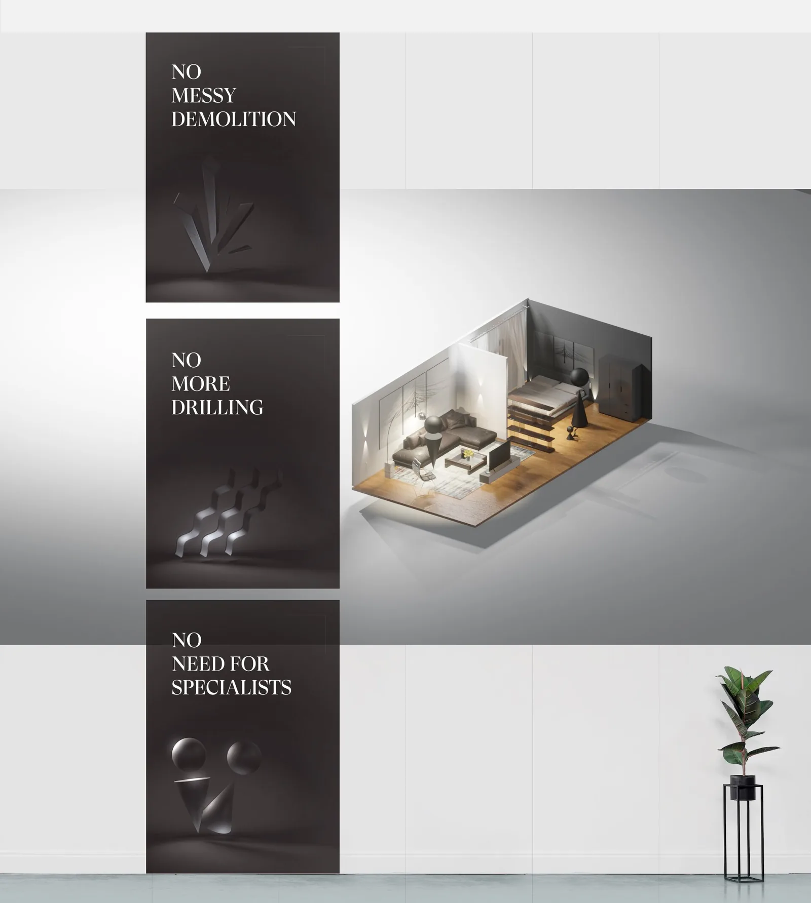
It is one long scroll, built in a fixed order: hero, what you no longer need, the problem, numbers, the product, the buying flow, a sign-up. Right after the hero come three dark cards: no messy demolition, no more drilling, no need for specialists. After the problem and the choices comes a short run of numbers: a third of the world’s waste comes from construction and demolition, 38% of CO2 emissions, and an area the size of Washington DC is demolished and rebuilt every year.
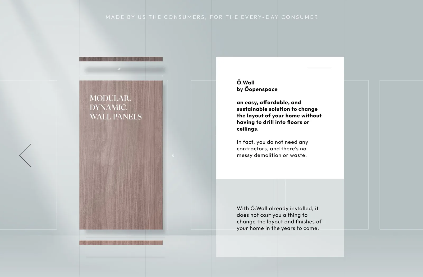
Then the product, wall panels explained in a few lines, with three short columns on durability, natural materials and sound.
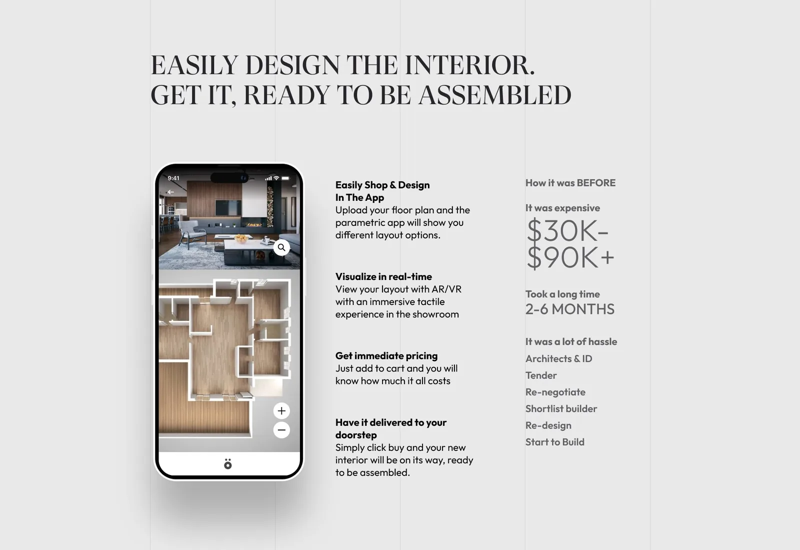
Then the app. You upload a floor plan, see layout options, check them in AR or VR, get a price and have it delivered.
Two “how it was before” columns put the old costs beside the new ones: $30K to $90K and two to six months for an interior, $90K to $250K and six to twelve months for a renovation, against $0 to $50K and one to fifteen days with Ö.Wall. Those are Öopenspace’s own figures on the page, not ours. The mobile version gets its own shorter headline about spaces that adapt as life changes.
What we have instead of a metric
There is no conversion number here. It is a pre-launch page, so nothing has been tested yet. What we have is Aaron’s read on it after a tight budget and a hard deadline: “And believe me, it looks amazing for what we injected in it.”
On January 16, 2023 he ended the contract. That afternoon we fixed his last round of edits anyway and sent the files. The next morning he asked whether the page could live on his Shopify domain at /o.wall, and we said it should.
Designing a product page for something that doesn’t fit a template?
Modular furniture, convertible spaces, any physical product with a digital-only sales page tends to break generic landing page templates, because the whole pitch depends on showing a transformation, not listing features. If that is the page you are trying to build, we will take a free look at what you have and tell you what we would change.